Staygo App Concept
Personal Project
2020
Overview
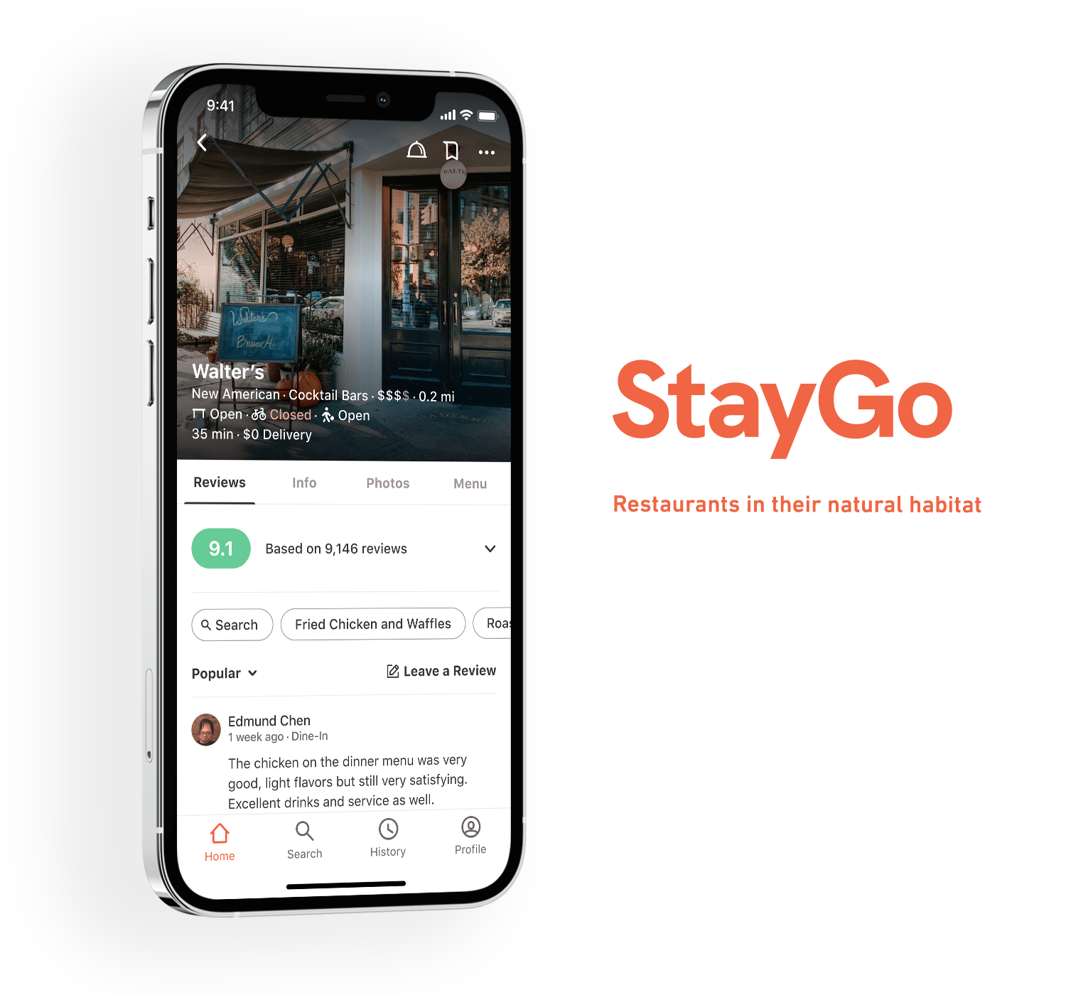
StayGo is a mobile app concept that serves as a one-stop hub for restaurant reviews, reservations, delivery, and pickup orders.
StayGo is built on two core principles:
Fair and Democratized Reviews
StayGo ensures that restaurants cannot pay to influence review visibility. Ratings are based on multiple factors (e.g., food quality, dine-in service, delivery packaging), not just a simple 5-star system. Review visibility is determined by community upvotes and downvotes, with more credible reviewers gaining prominence. Negative, bad-faith reviews get downvoted, reducing their impact, while high-credibility users get visibility without their ratings carrying disproportionate weight.
One App for All Restaurant Needs
Reviews, reservations, and on-demand orders all centralized in one place.
Contents
User Research
Even though this was a personal project, I approached it like a real-world product. Without actual stakeholders or business constraints, there were limits to how far I could take it. However, I wanted to avoid designing in a vacuum, so I conducted some light user research to guide my decisions. Given my limited time, I chose to do this research upfront rather than through iterative user testing later on.
I conducted a lo-fi card sorting exercise, asking friends to prioritize different business details—such as hours, reviews, and photos—that influence decisions about dining in or ordering delivery. Instead of physical cards, participants ranked these details using assigned letters, which I then translated into numerical values.
This feedback became a guiding reference, especially when designing the Restaurant Details page.

Looking back, I was aiming for qualitative insights but tried to force them into a more quantitative format. If I could do it again, I’d simply ask people what is most important to them in the restaurant discovery process, leaving the responses open-ended. This approach could reveal new insights from how answers are phrased or additional feedback about competitor products. I’d also expand the survey to include questions about common frustrations users face during these tasks.

Wireframes
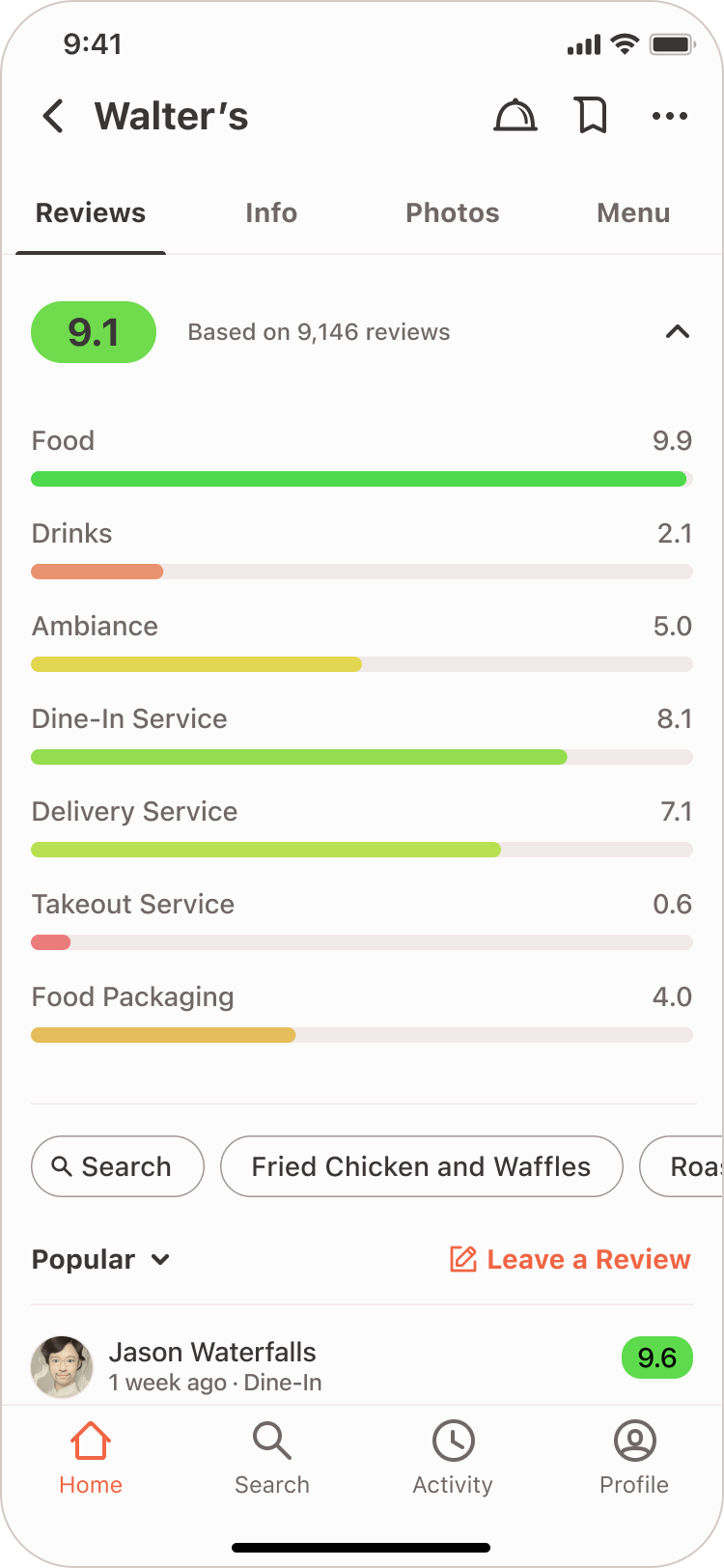
Restaurant Details is where all the action happens—users can read and write reviews, look up photos and all other restaurant details, make reservations, and order. For this reason, it was important for all these main actions to be easily done from the default view.
The initial design included a floating action button for writing reviews, but I scrapped it since it could be intrusive. I also didn’t want to overemphasize writing reviews, as the Restaurant Details page needed to focus on all key actions related to dining, not just reviewing.

Restaurant Details Version 1
For making orders, I chose to place the icon for that action in the top right, alongside favoriting and other actions. It was surprisingly challenging to come up with an icon that represented both delivery and pickup orders, but I settled on an icon of a plate cover usually associated with hotel room service orders.
Instead of the typical scale of 5 stars, it was important to incorporate a rating system that was more detailed and really spelled out the strengths and weaknesses of a restaurant. Ratings were given on a scale of 1-10, down to the first decimal point. These ratings would be an average of ratings of criteria like food, ambiance, or dine-in/delivery service.
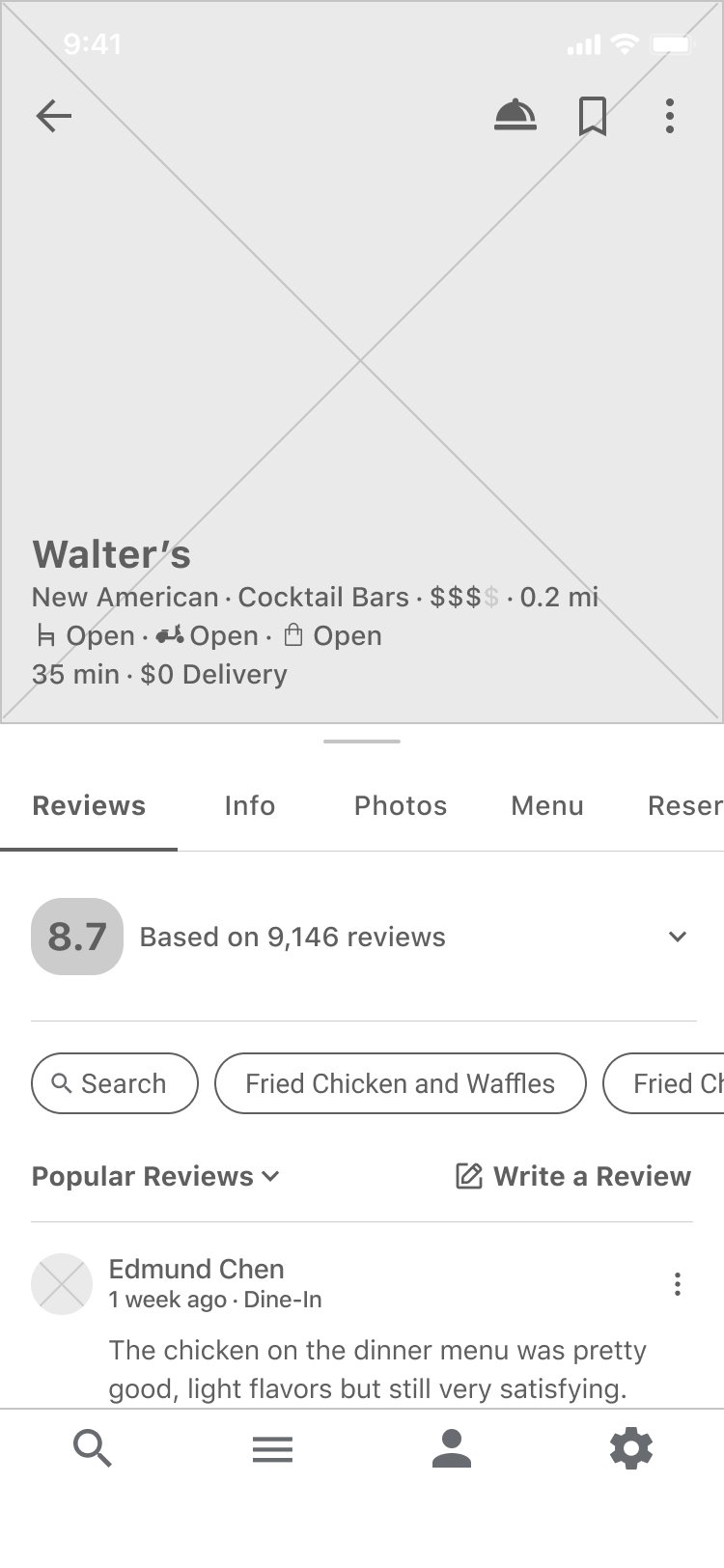
Restaurant Details - Default view
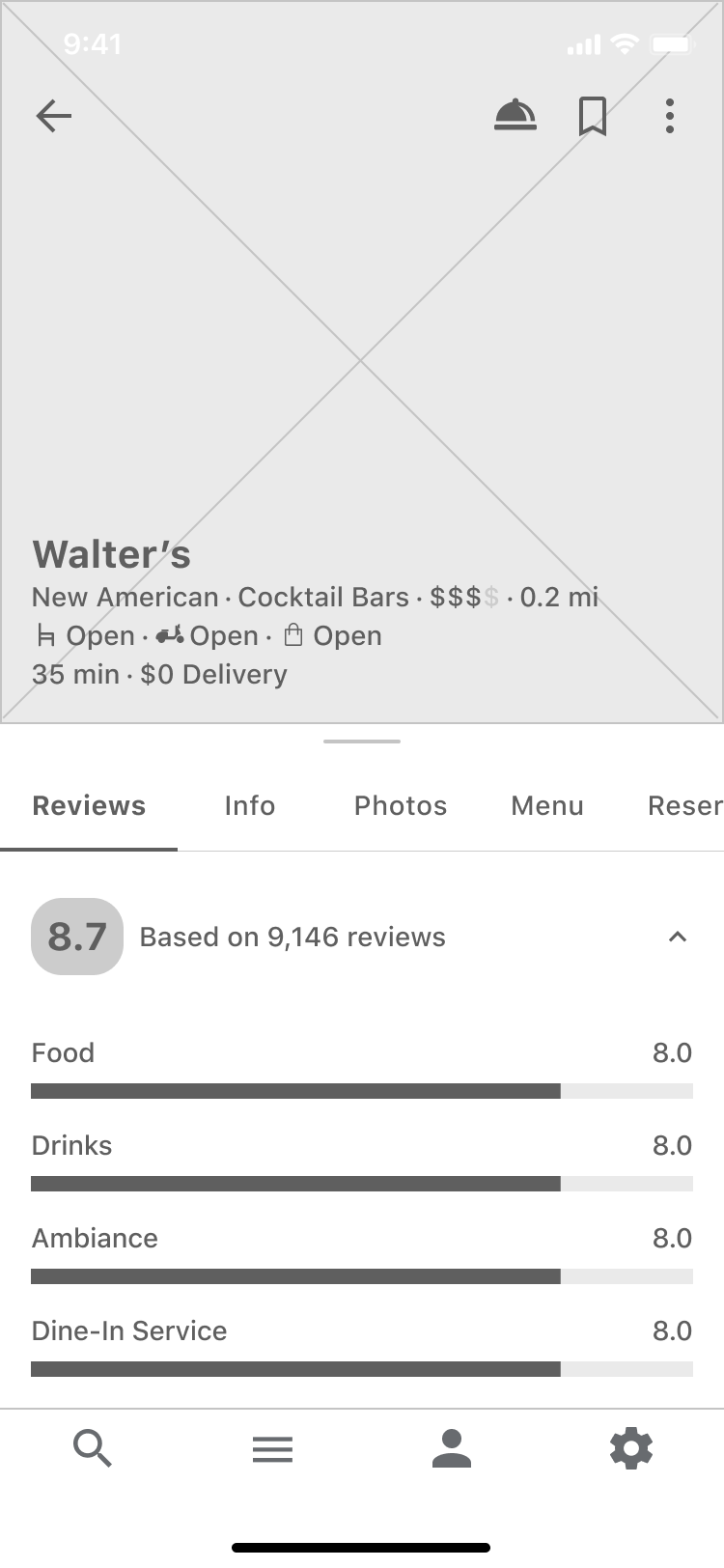
Ratings expanded

Photos tab

Dine-in menu
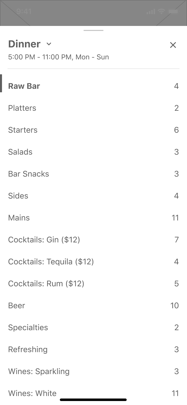
Menu category switcher card

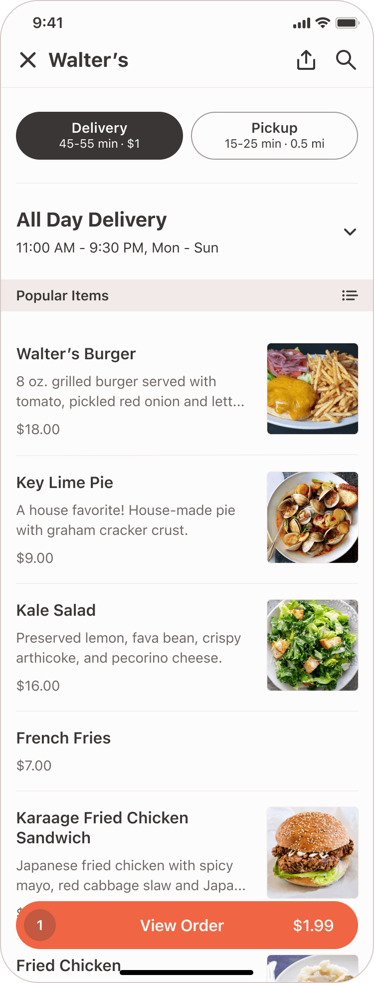
Delivery menu
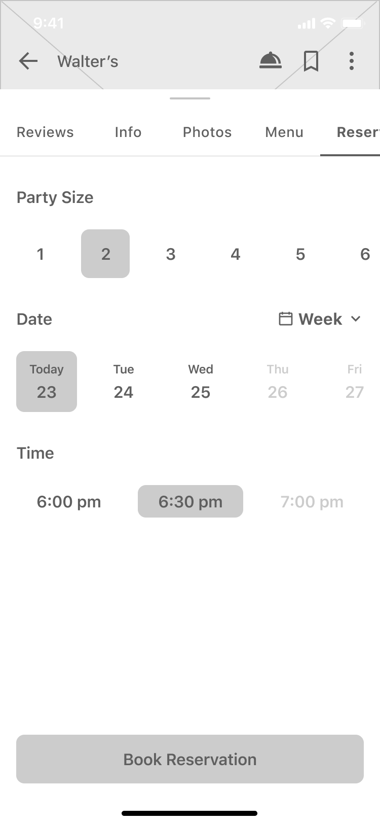
Making a reservation

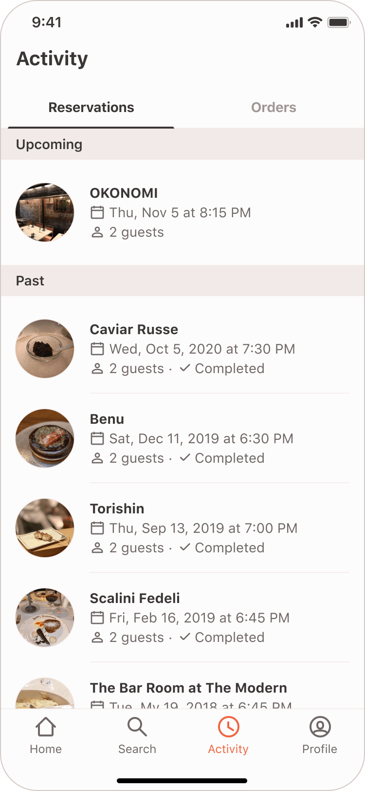
Reservations tab
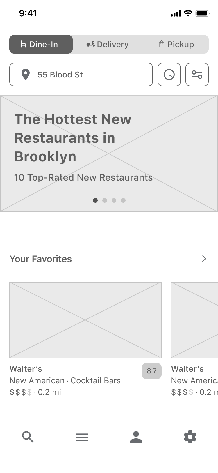
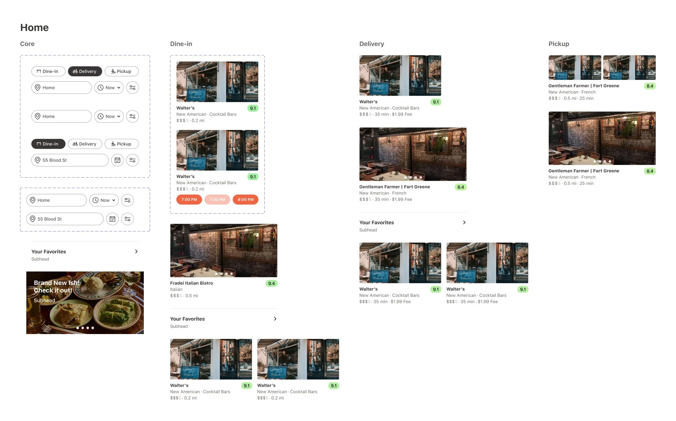
Home

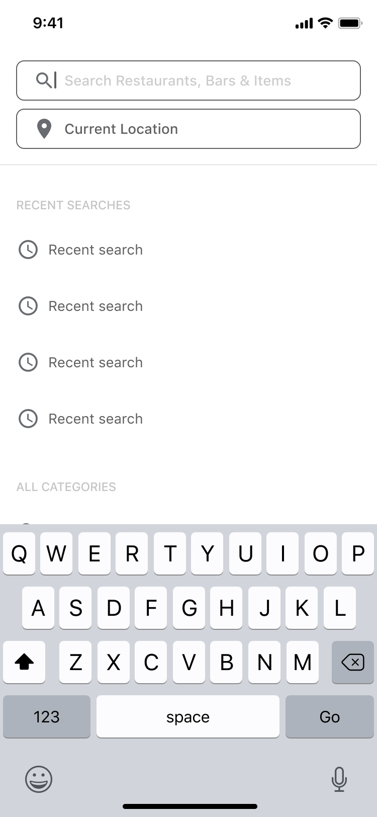
Search
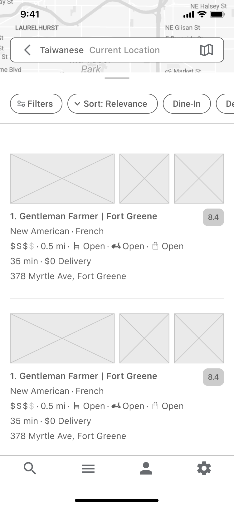
Search results - list view
User profile
Design System
Components


Color System
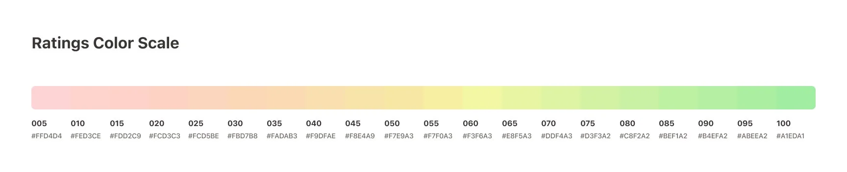
Ratings Color System
A color scale was needed to visually represent the quality of a restaurant’s rating, both for the overall rating and individual reviewer scores.
Designing a scale—such as transitioning from yellow to green—is not always straightforward, as different hues convey varying contrast levels. To achieve an optimal result, it’s important to set custom curves for factors like hue, saturation, and brightness. I used ColorBox, a web tool that offers features for optical optimization, to fine-tune the color scale for clarity and effectiveness.
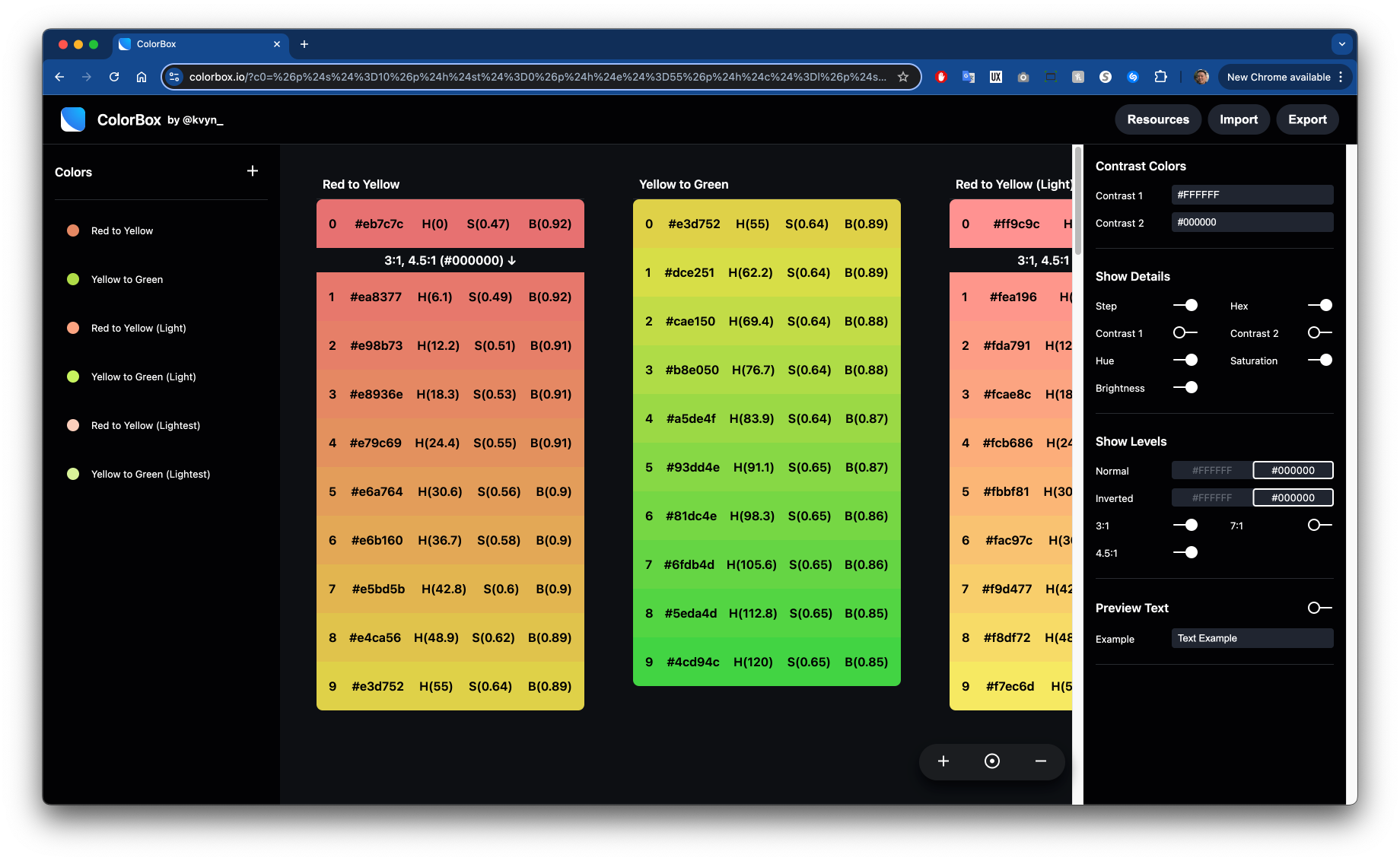
I then exported JSON values from my ColorBox gradients into Figma to test how those values appeared in the context of the UI designs.
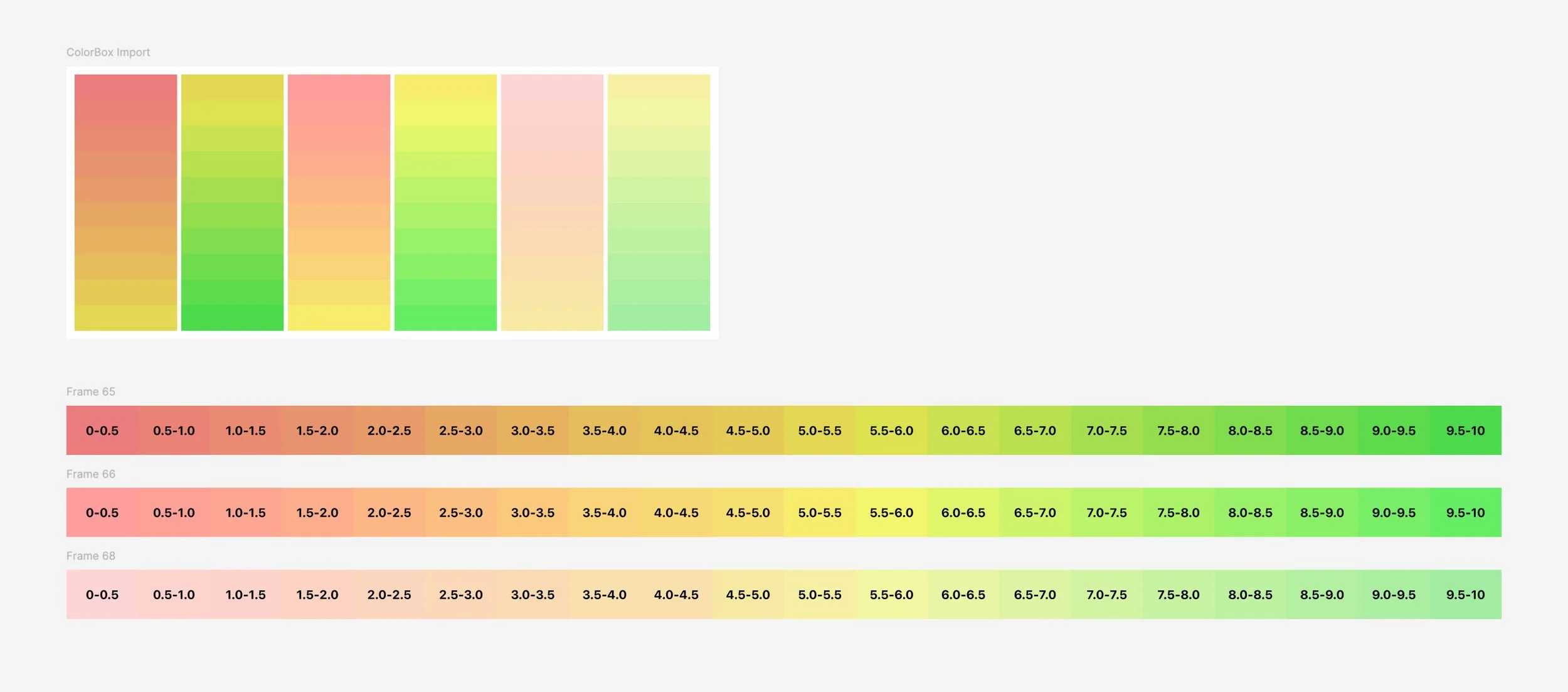
The initial color scales looked good on their own but were too saturated when applied to the ratings pill I designed. They drew too much attention within the mostly white layout.
While I wanted to use these colors for the bars in the review breakdowns, they didn't provide enough contrast for visually impaired users, limiting their accessibility.
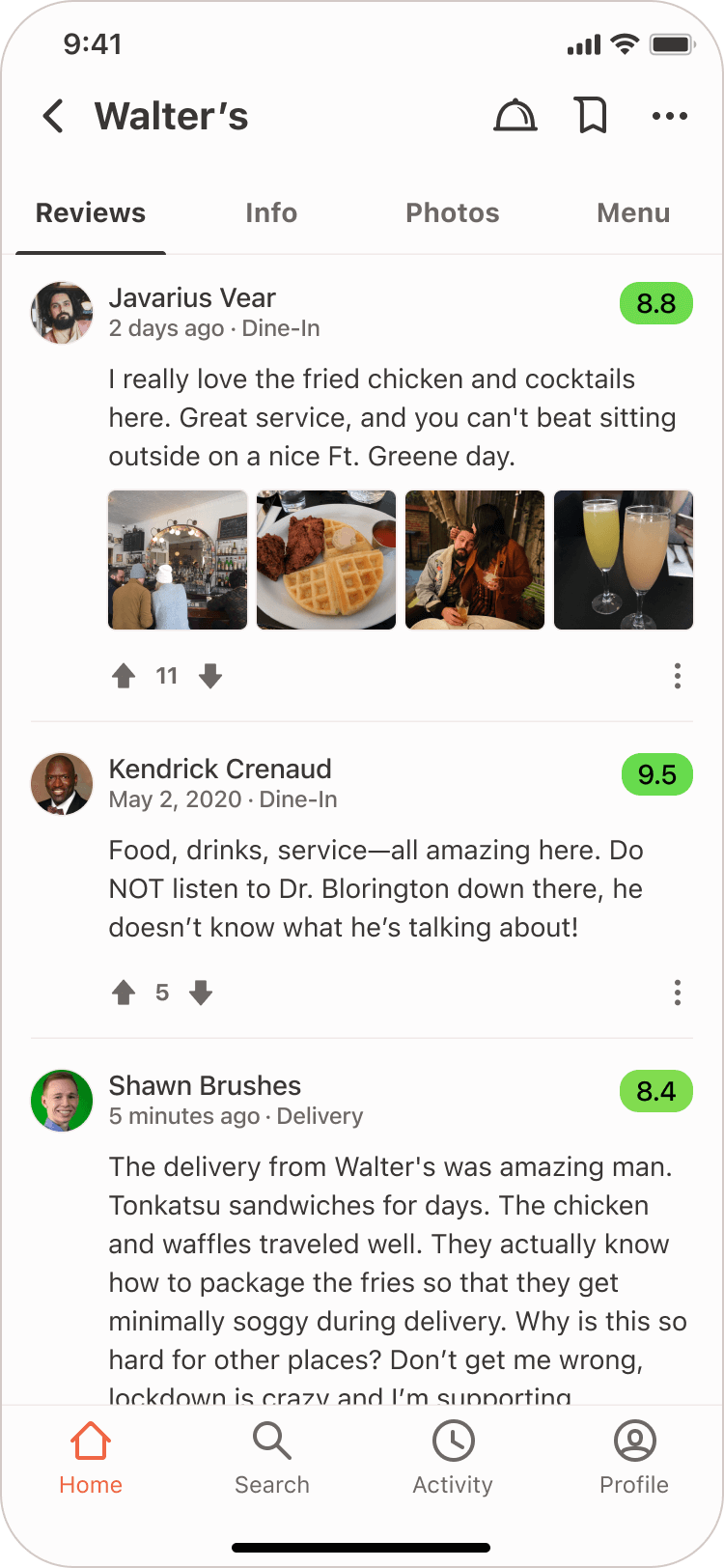

I ultimately chose a much less saturated color scale and used black bars to represent individual category ratings for better clarity and balance.

Final Designs
Getting Started


Home Tab

Dine-in view

Reservations view active

Delivery view

Pickup view
Search Tab

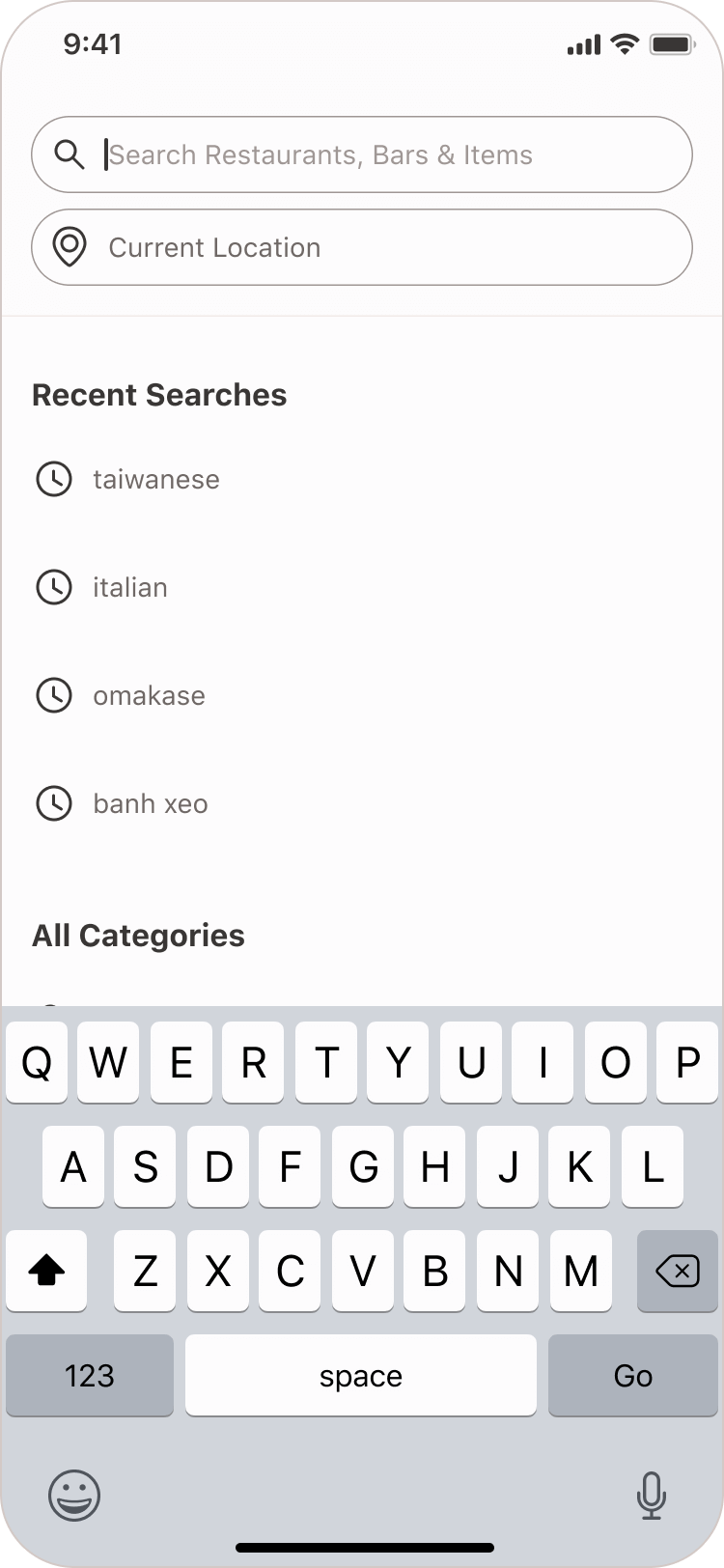

List view

Map view

Activity Tab

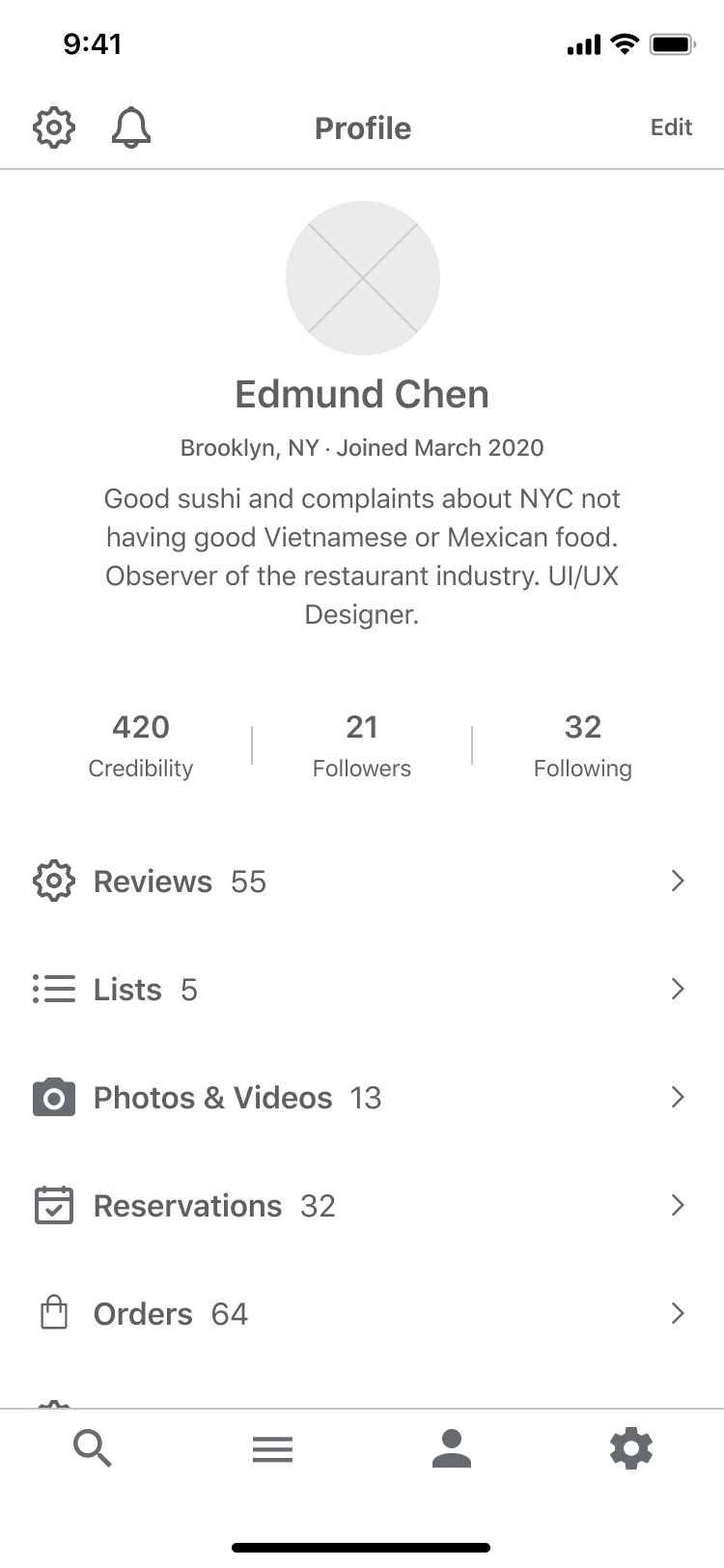
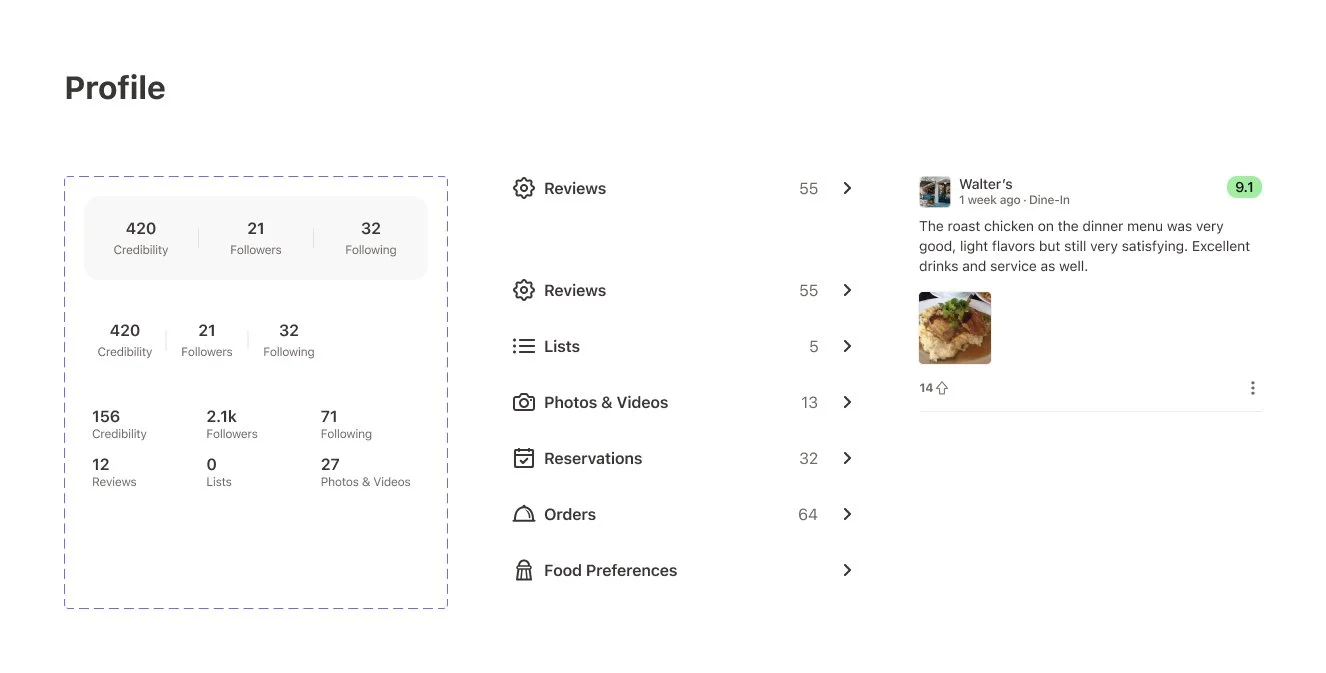
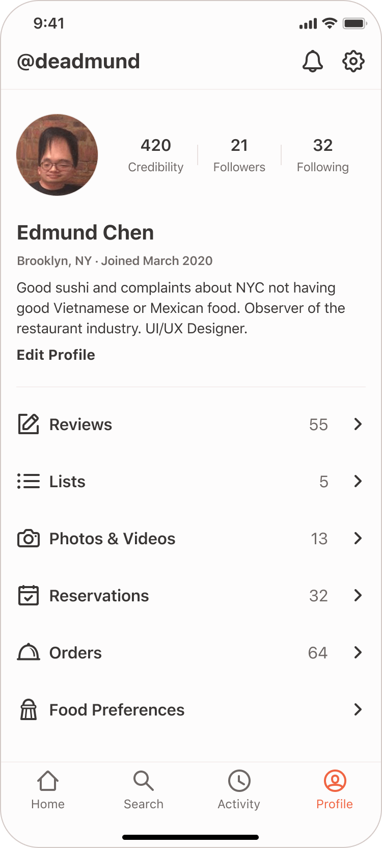
Profile Tab

Restaurant Details


Profile overview card

Full profile card
Reservation Flow


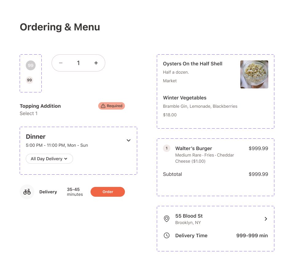
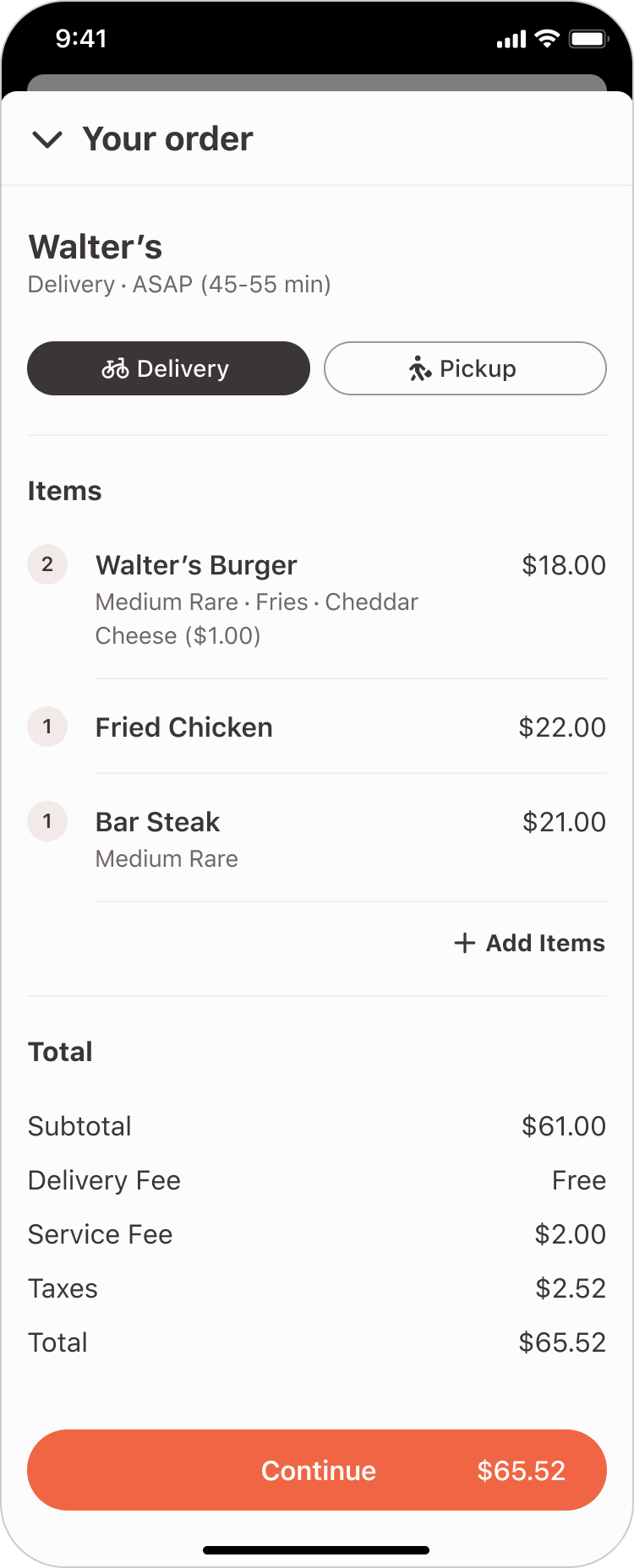
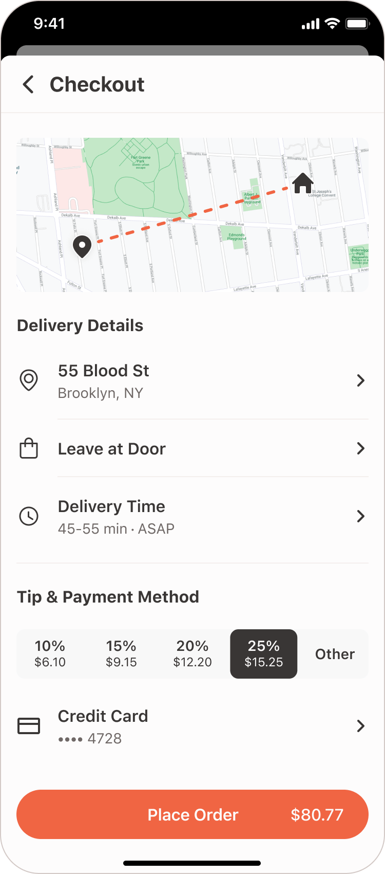
Deliver/Pickup Order Flow


Conclusion & Key Takeaways
Working on the StayGo app concept was an incredibly rewarding experience that allowed me to dive deep into mobile app design, from research and architecture to creating detailed UI components. Since this was a personal project, I had the creative freedom to experiment, make mistakes, and fine-tune my process without the typical real-world constraints.
One of my biggest takeaways was learning to strike the right balance between aesthetics and usability. While I initially focused on making the design visually appealing, I quickly realized that structuring tasks in a way that felt natural to users was far more important. This led to decisions like removing the floating action button for writing reviews and refining the color scale to make the UI more accessible and balanced.
The user research I conducted was also a key learning experience. Although my initial card-sorting exercise gave me some direction, looking back, I’d approach it differently. Asking more open-ended questions and digging deeper into user pain points could have uncovered more valuable insights. This project really drove home how essential it is to let users' needs guide design decisions more naturally.
Building the design system was both a challenge and a highlight of the project, especially when it came to crafting the color scale for ratings. I learned how important it is to test colors in real-world UI contexts to make sure they not only look good but are also functional and accessible for all users.
Ultimately, StayGo reinforced my passion for creating smooth, user-friendly experiences. It gave me a hands-on opportunity to refine my skills in mobile app design, building component libraries, and conducting UX research—skills that I’m excited to carry into future projects.