DojoMojo – Signup Form Builder
Improving Usability and Reducing Drop-Off
Overview
Company
Timeline
Role
Visit
Contents
Intro
DojoMojo is a B2B marketing platform that helps direct-to-consumer brands grow their customer base through sweepstakes, ecommerce signup forms, and SMS campaigns.
When I joined DojoMojo in 2021, the platform was primarily known for its sweepstakes feature. However, the product team was focusing on expanding SMS marketing capabilities to drive clients toward paid plans and increase revenue. One of the key features I took ownership of during this time was the Signup Form Builder.
Business Problem
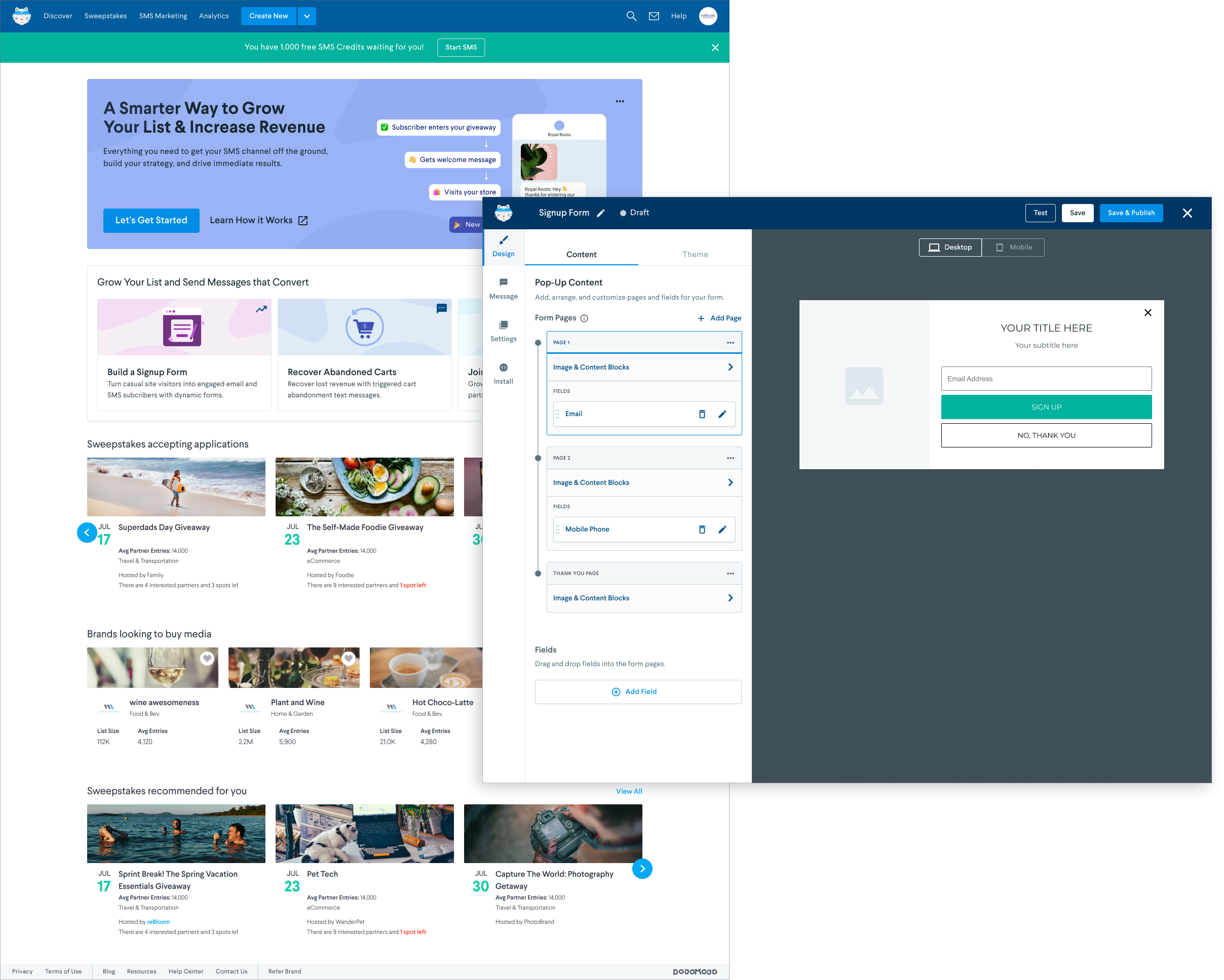
The Signup Form Builder was a new way for users to expand their customer base beyond sweepstakes. Brands could design their own signup form pop-ups and integrate them into their ecommerce sites, growing their email and SMS lists with every signup. By the time I joined the DojoMojo team, the Signup Form feature had evolved from a managed service to a fully-fledged WYSIWYG creative editor, offering brands extensive content and design customization.
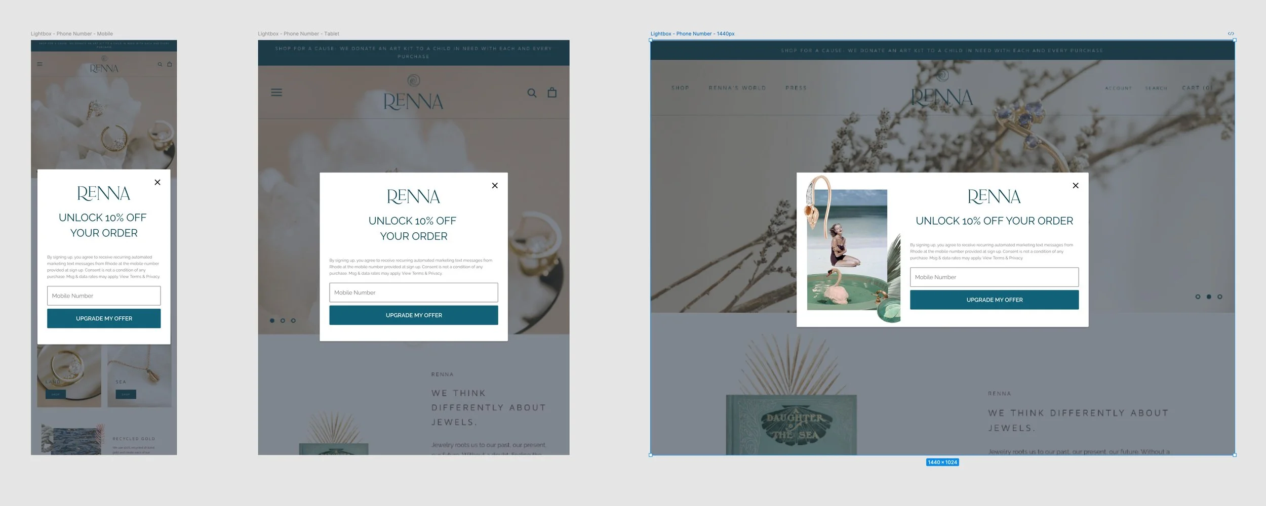
Custom signup forms designed in-house in Figma, before users could create their own on DojoMojo.
Signup Form Builder v1.0
DojoMojo had around 600 active users, most of whom were using the sweepstakes tool. Once we introduced SMS post-entry marketing, 73% of users adopted the feature, and within a few months, 31% were actively sending SMS campaigns. The Signup Form Builder was created to further grow SMS-driven customer acquisition.
Initial engagement was promising—44% of users who adopted post-entry SMS clicked to create a signup form. However, only 7% of those users completed and published their forms, revealing a significant drop-off that needed addressing.

The product team decided to do a UX audit of the Signup Form Builder to see what design improvements we could make.
Identifying The Issue
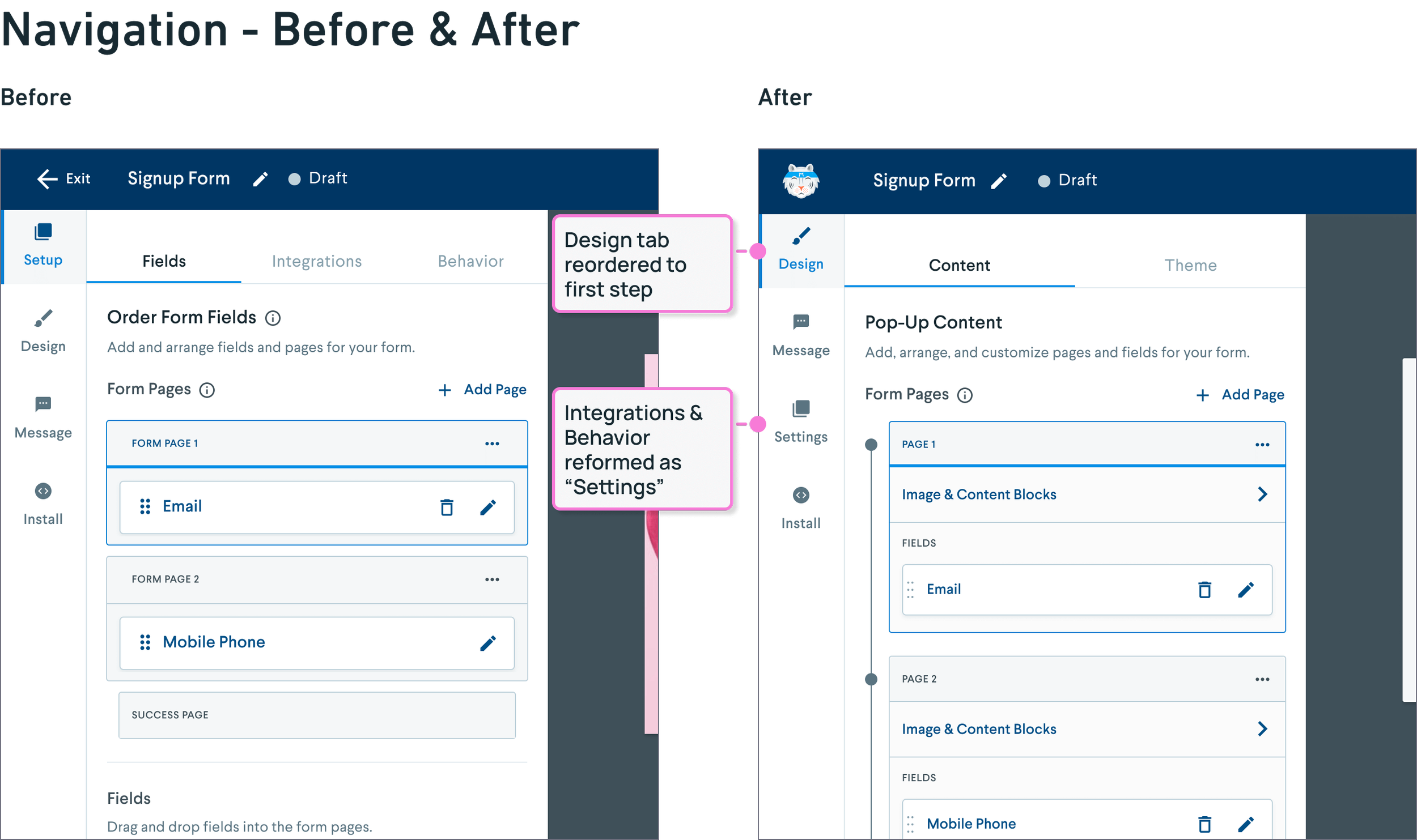
The original Signup Form Builder layout prioritized technical elements like ESP integration and behavior settings, while content and design-related tasks were grouped under separate tabs. As a result, the interface for adding and editing fields and drop-downs was grouped with integrations and behavior settings in the “Setup” tab. In theory, one could make an argument for this decision, as the “Setup” tab consisted of tasks related to the overall structure of the user’s signup form.
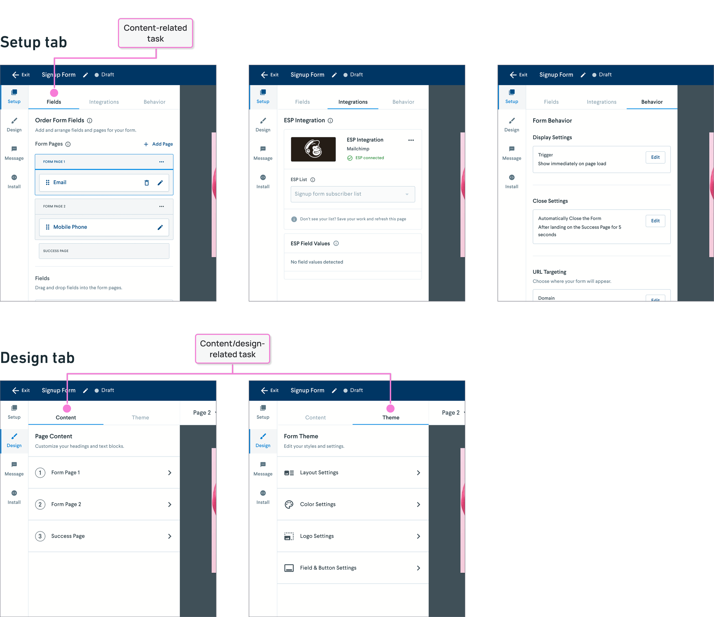
Customer interviews revealed that this setup caused confusion. Users perceived form fields as a content-related task, and having them grouped with technical settings disrupted their flow. They frequently found themselves bouncing between steps, leading to frustration and disengagement.
Competitor analysis also supported the need for clearer task contextualization. Platforms like Wisepops separated popup layout choices and content blocks.

Mailchimp's form builder kept style, layout, and display settings distinct from content editing, which occurred directly in the form preview.

The Solution
After reviewing user feedback and competitor research, it became clear that we needed to restructure the navigation. I mapped out the full user flow and identified opportunities to consolidate content and design tasks for a more intuitive experience.
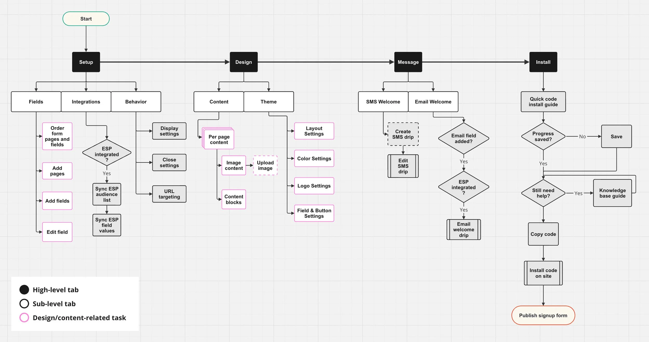
User flow - Before
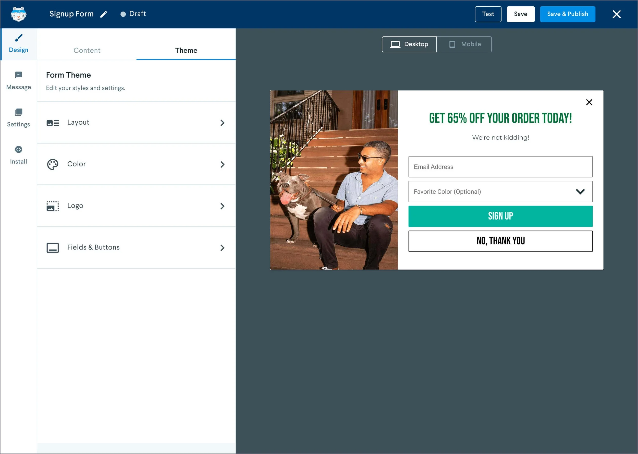
I reorganized all content and design actions under a new top-level "Design" tab, merging the "Fields" tab into a new "Content" section within it. This allowed users to handle fields, images, and content blocks in one place before moving on to visual design choices.

User flow - After
Customer feedback supported this decision, as users found it more intuitive to handle fields-related tasks within the "Content" tab. An additional opportunity made this change even more compelling: Previously, content options were tucked away in sub-drawers for each page of the signup form, making navigation cumbersome.
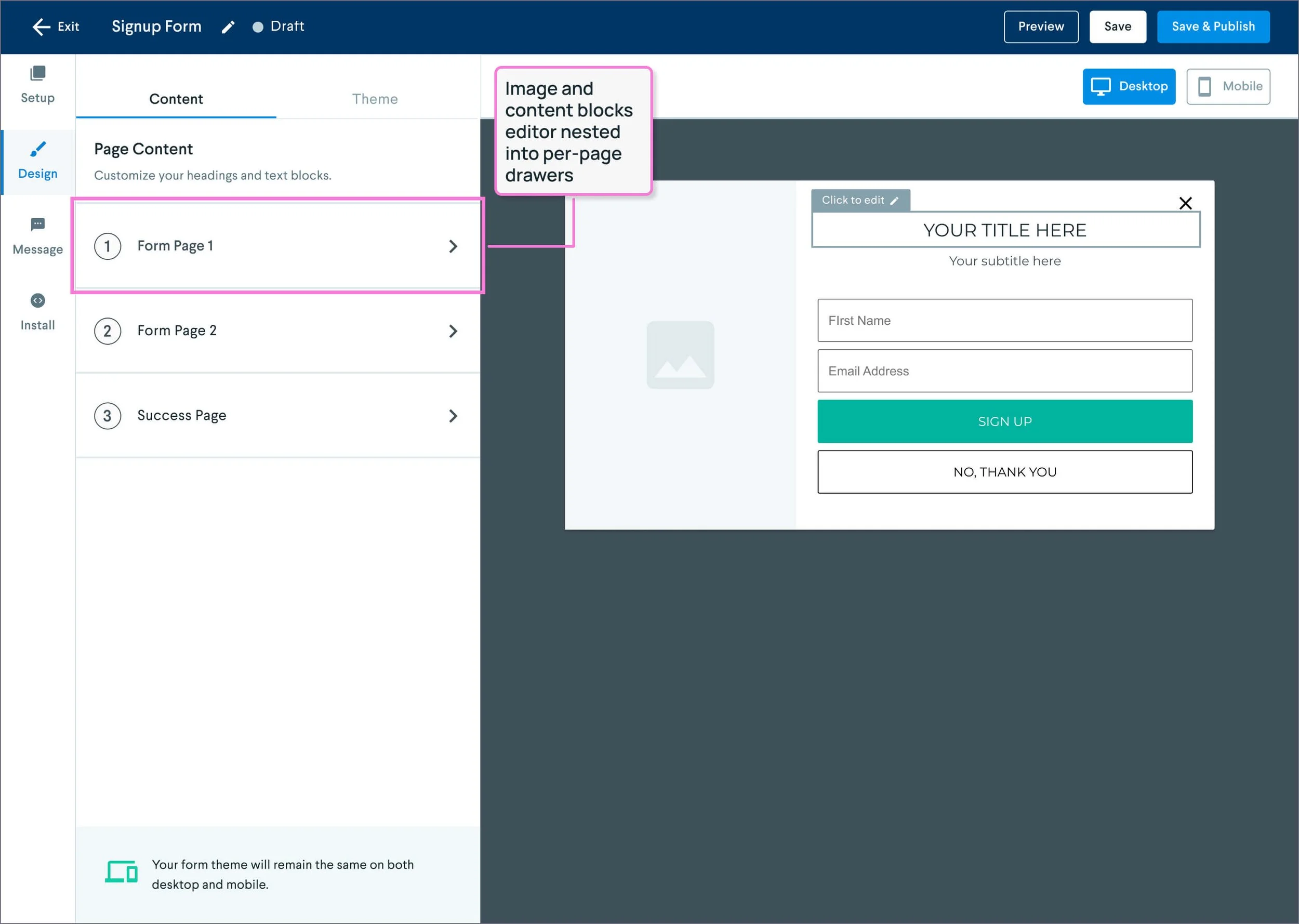
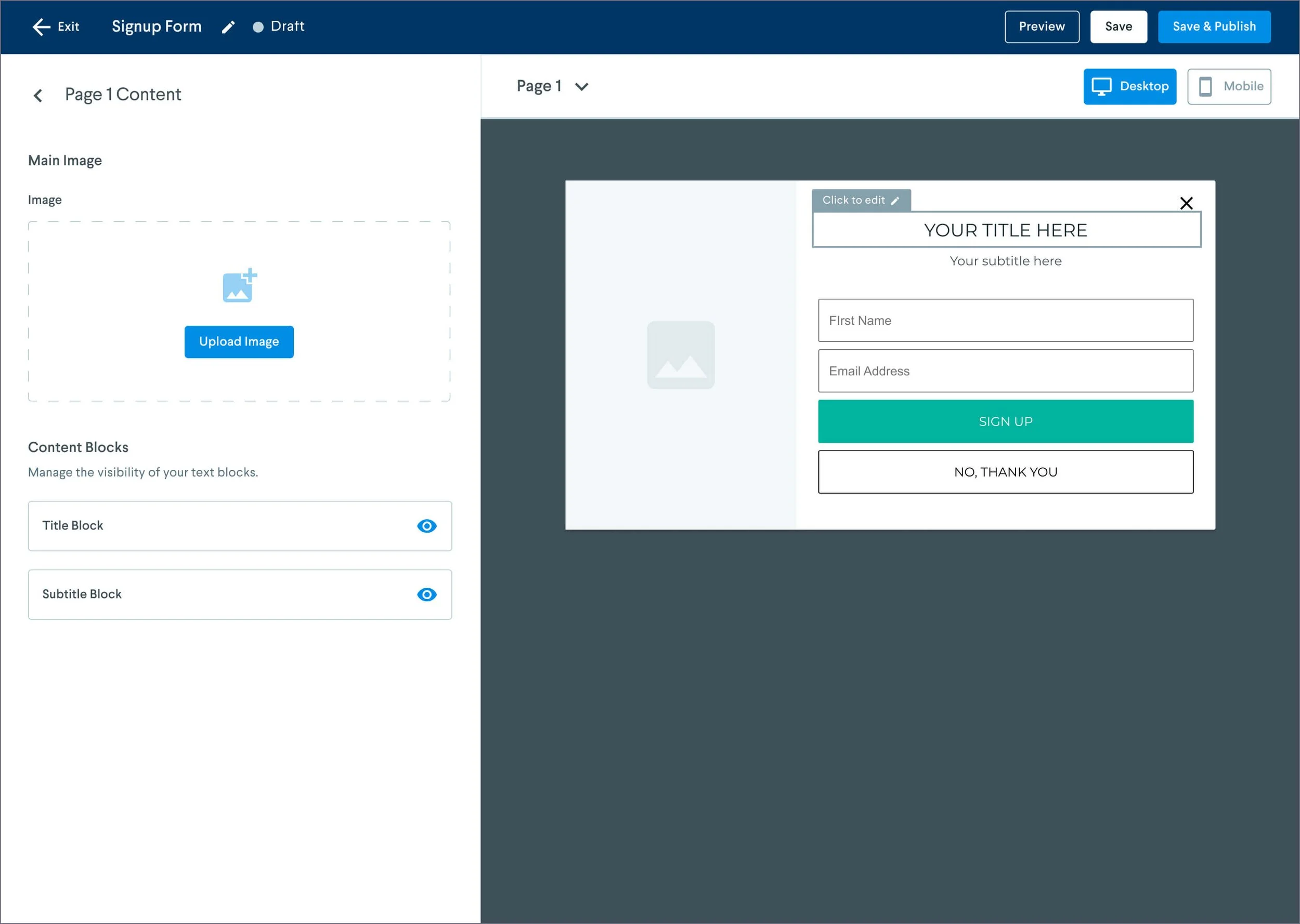
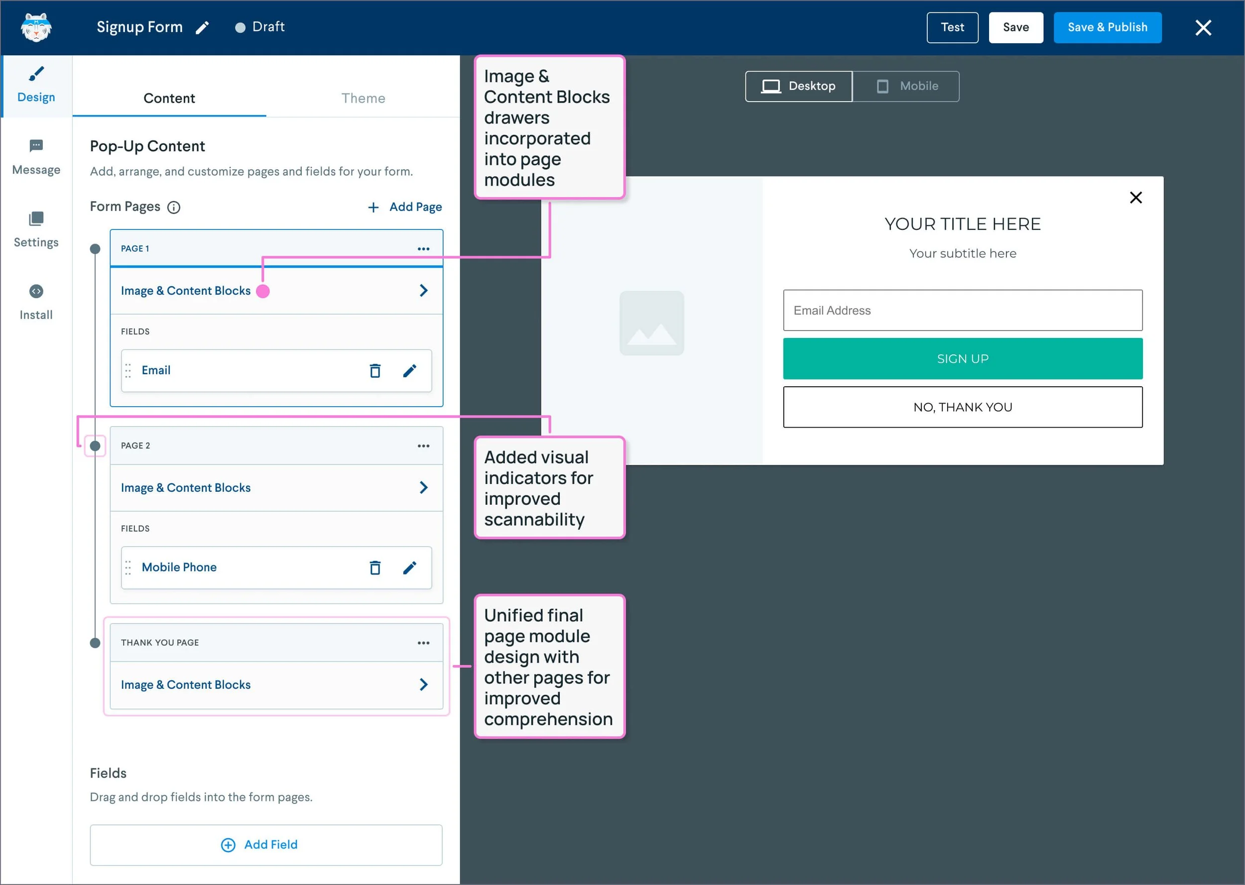
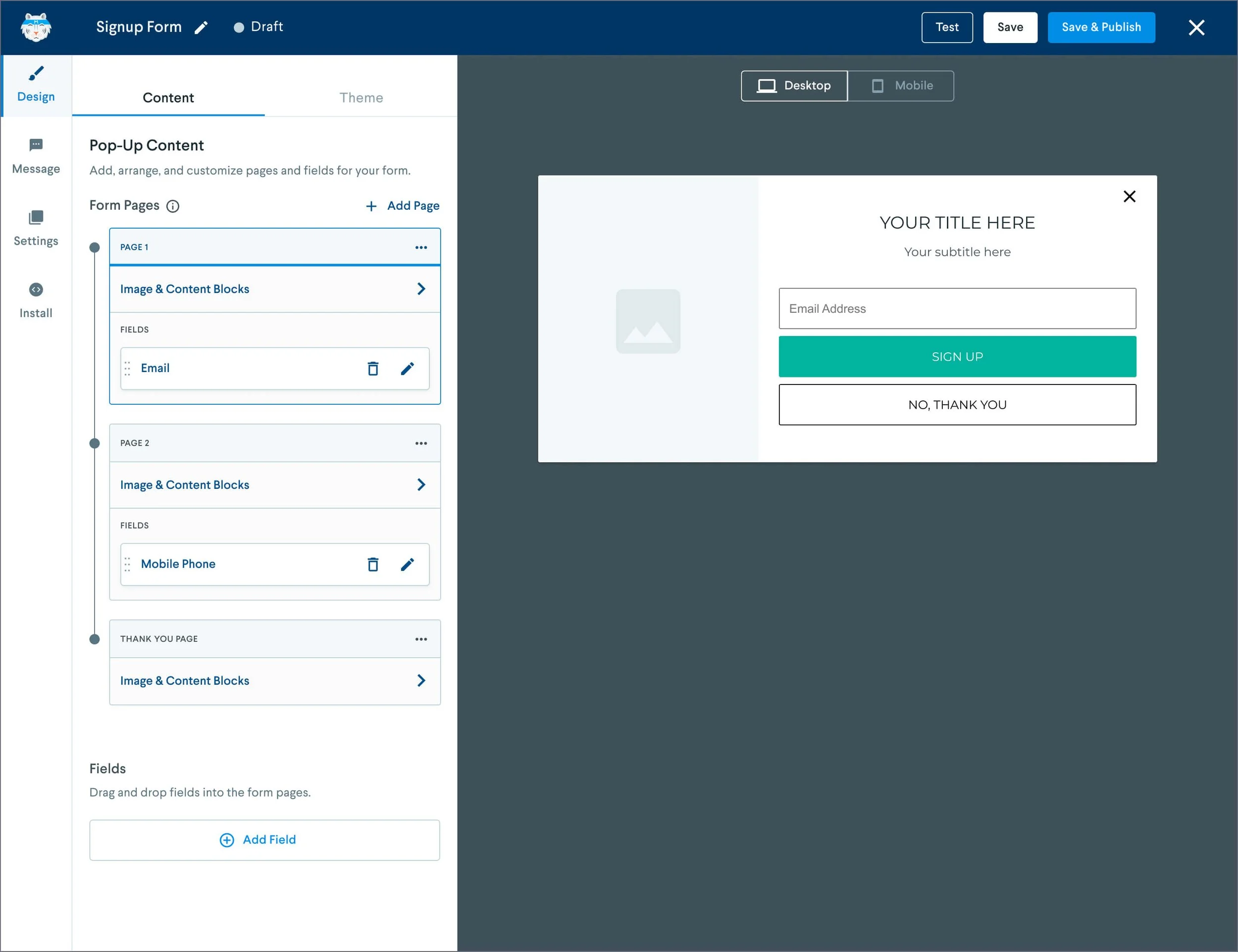
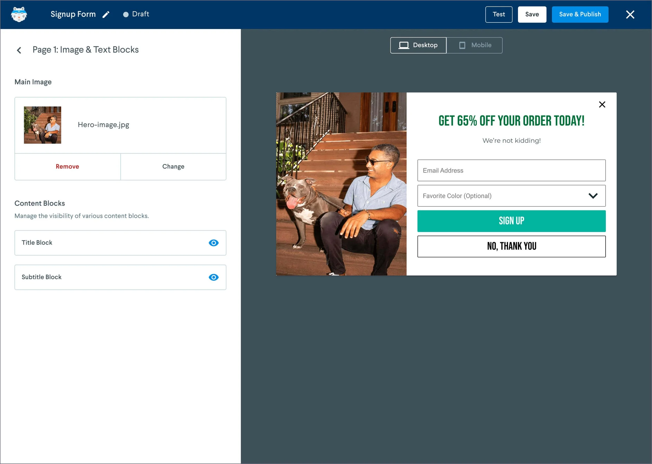
Content options per page.
The existing interface for managing form fields already did a better job of organizing tasks by signup form page. Each page’s fields were clearly visible, with the ability to reorder them via drag-and-drop.
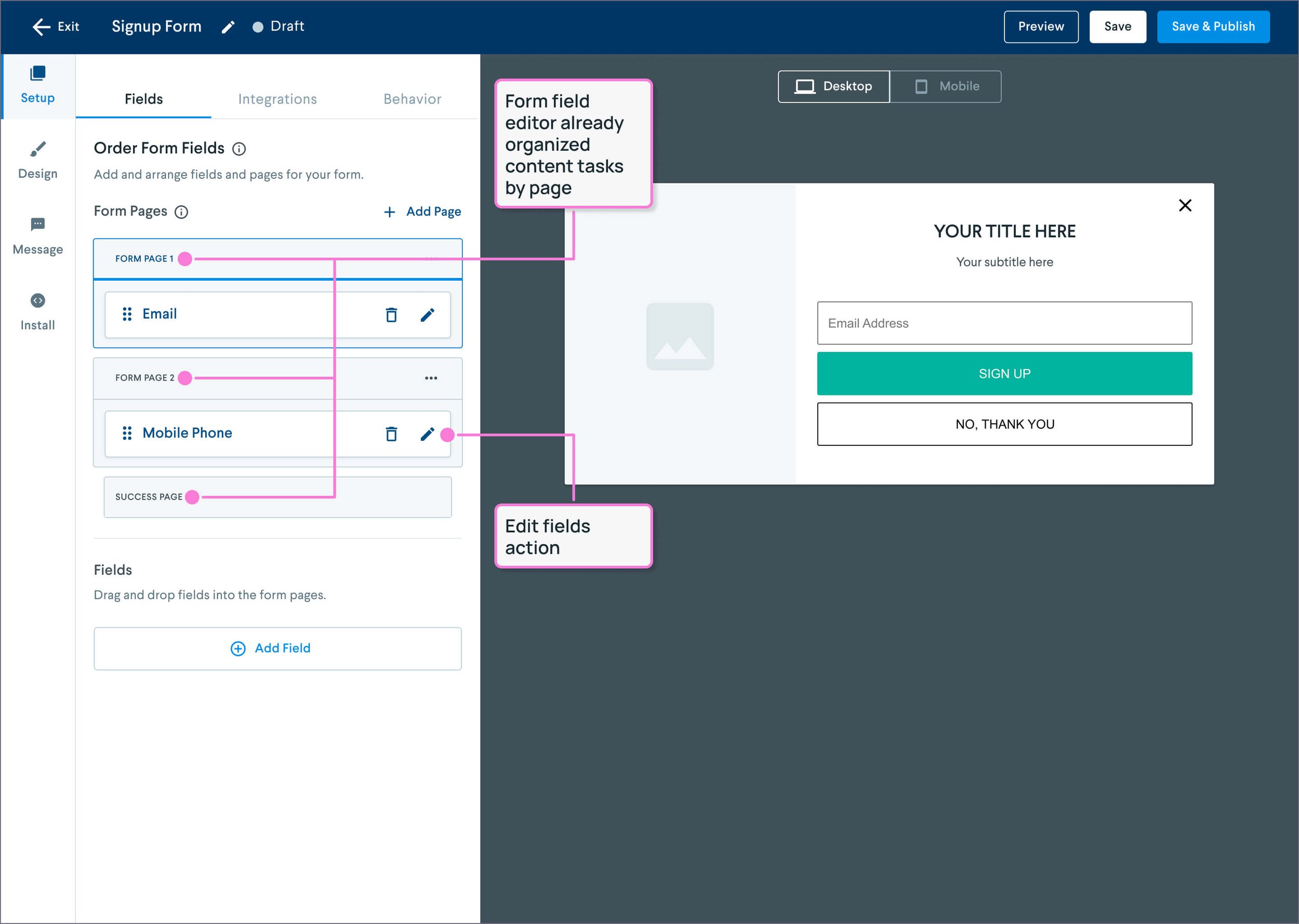
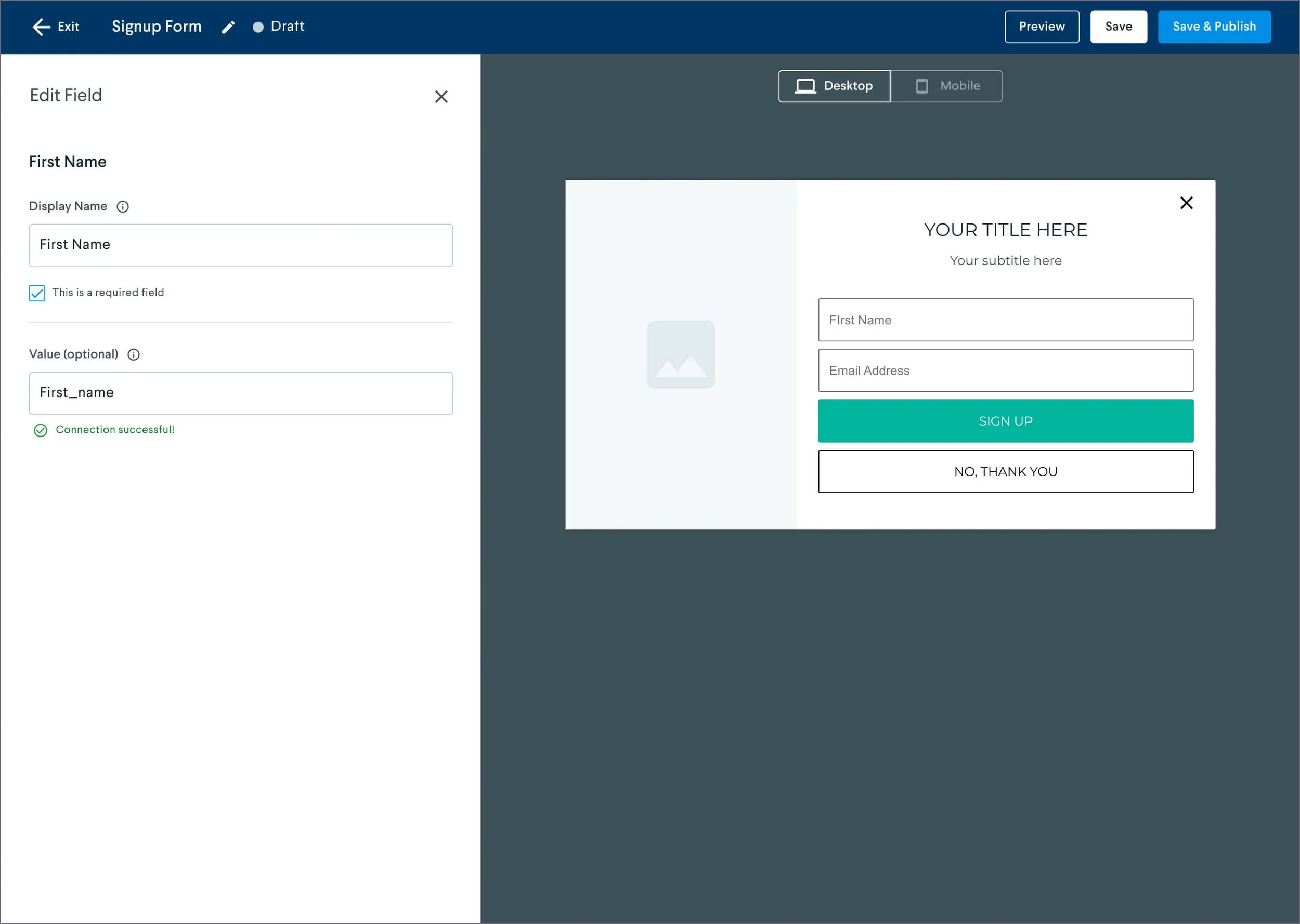
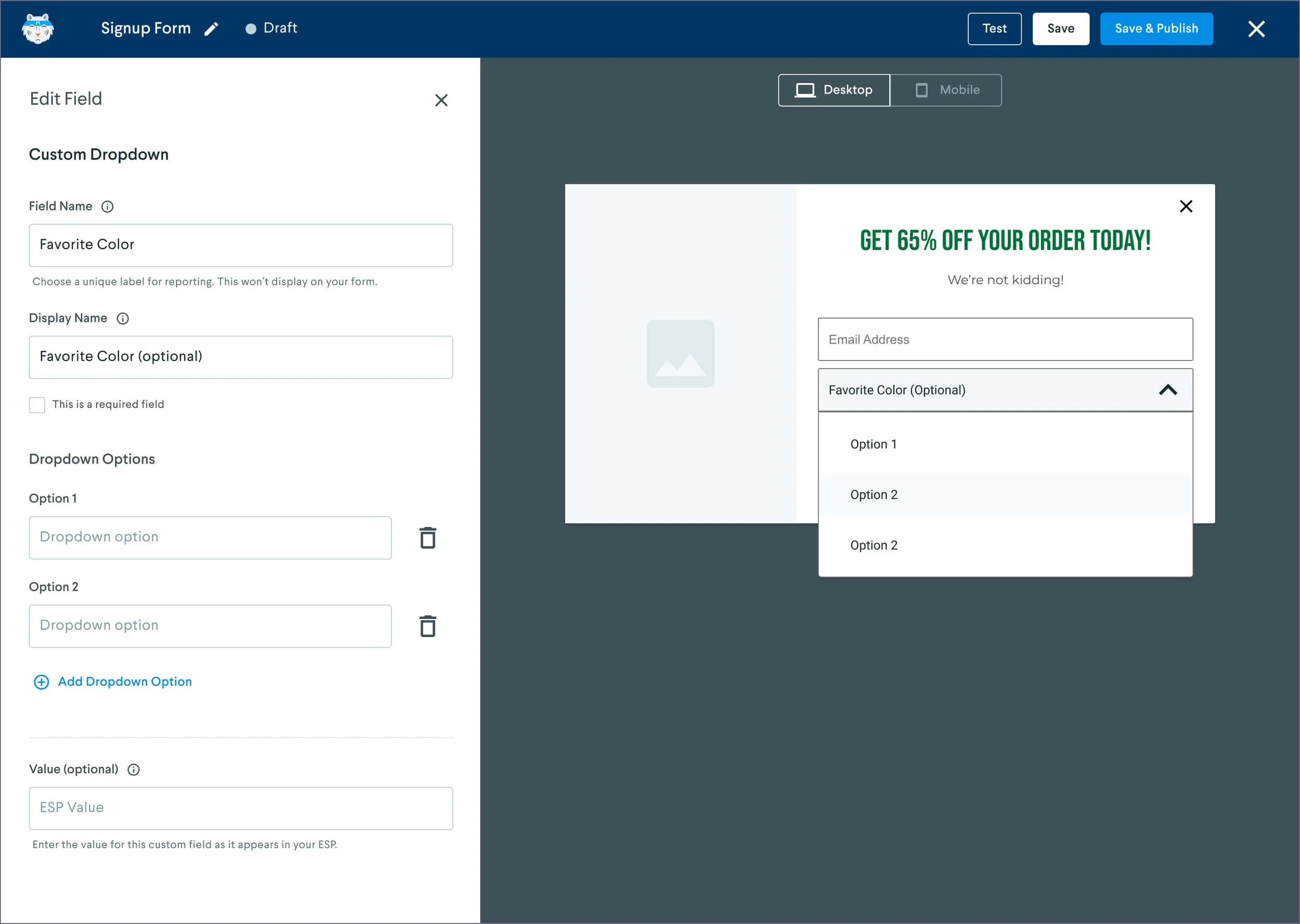
Edit Field drawer.
My solution was to integrate content tasks directly into this interface, allowing users to easily arrange images, content blocks, and form fields before moving on to design-related decisions in the next sub-level tab.
To further improve usability, I introduced a step indicator next to each page module, clarifying actions associated with each page. I also redesigned the final "Thank You Page" module, which was visually understated compared to the main pages. By unifying its styling, I ensured it received equal attention from users.
Another key change came from user feedback regarding the navigation hierarchy. Customers found it unintuitive to have the "Design" tab appear second in the top-level navigation. Given that WYSIWYG controls were available directly in the form preview, users wanted to complete all design tasks first.
In response, I moved the new "Design" tab to the top of the navigation. The previous "Setup" tab, now focused on technical settings after the removal of "Fields," was renamed "Settings" and placed further down in the navigation order.
Additional Improvements
Customer interviews also highlighted issues with the "Exit" button's placement. Positioned directly above the first top-level tab, it frequently caused misclicks, which led to users accidentally triggering the exit-without-saving prompt.
I addressed this by redesigning the "Exit" button as a standard close (X) icon and relocating it to the far right of the header, reducing the risk of unintentional clicks.

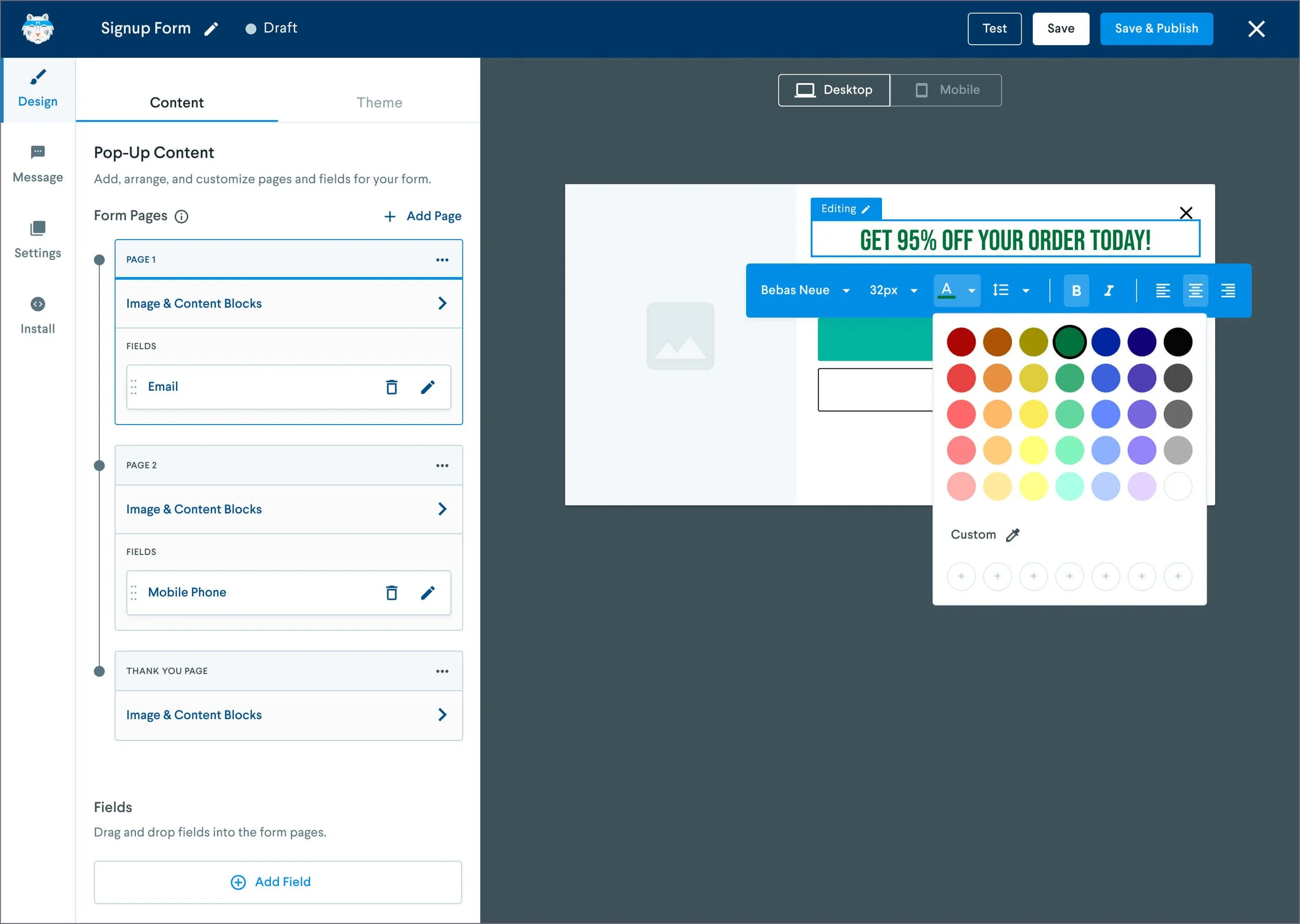
Final Designs
Design Tab - Content
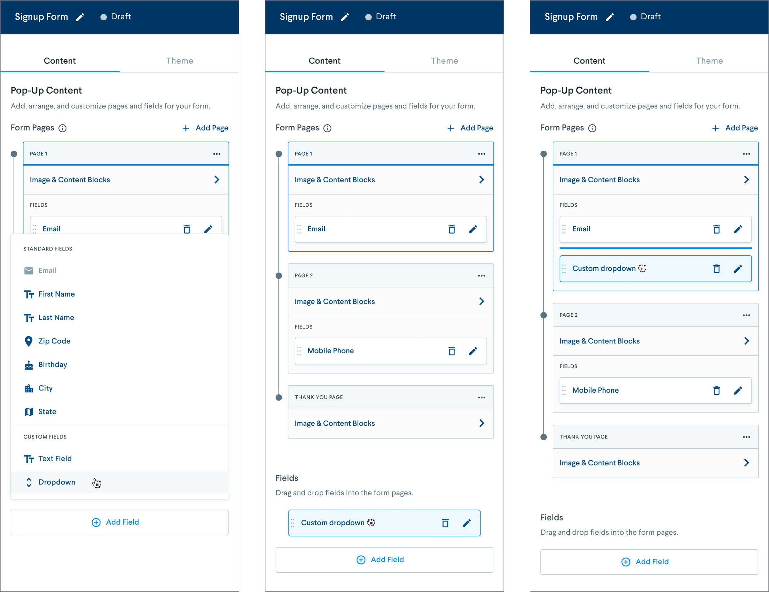
Adding a field with drag and drop into page.
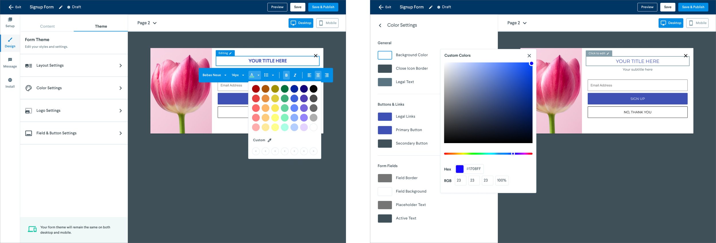
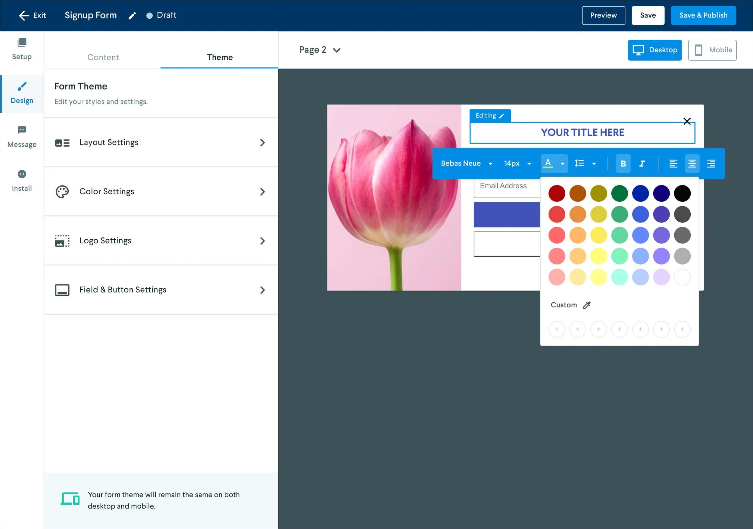
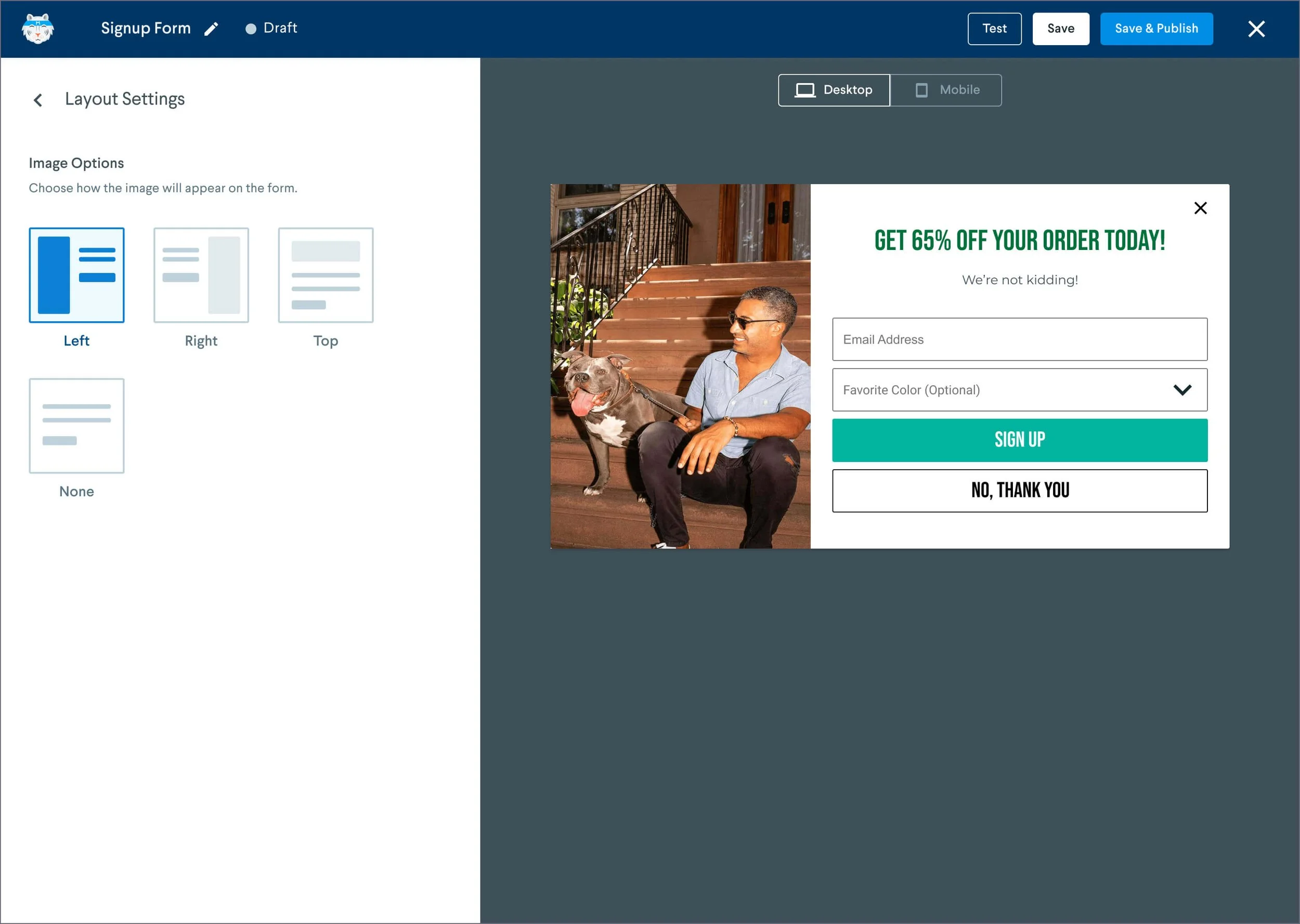
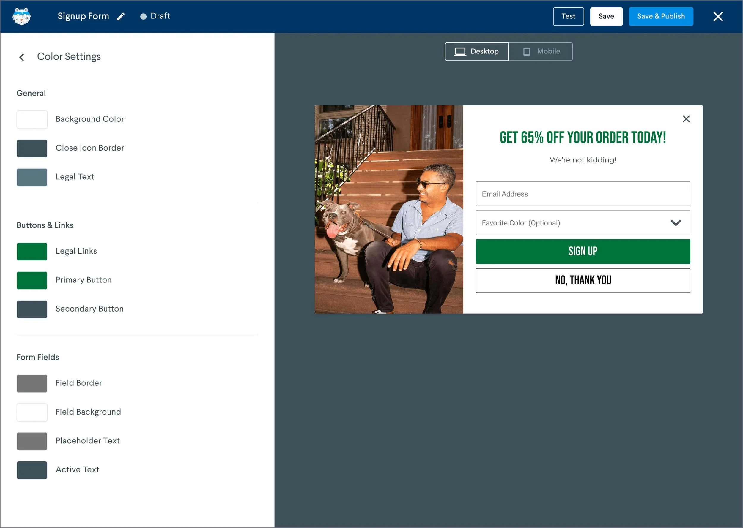
Design Tab - Theme

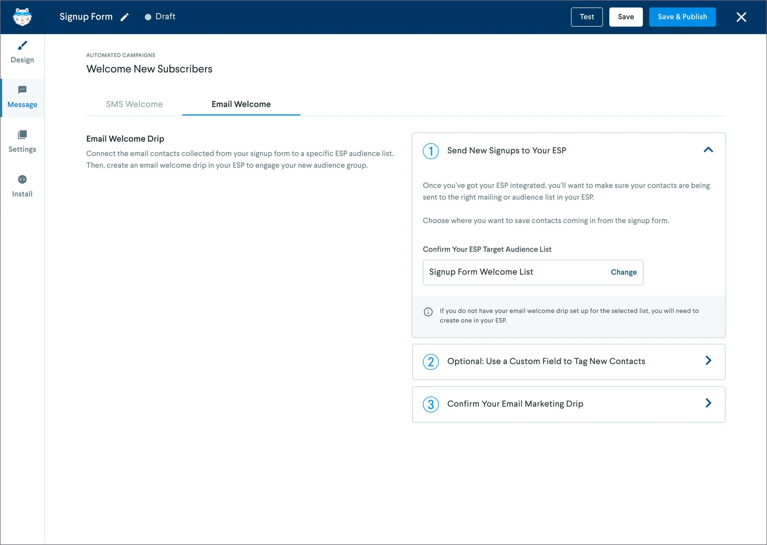
Message Tab
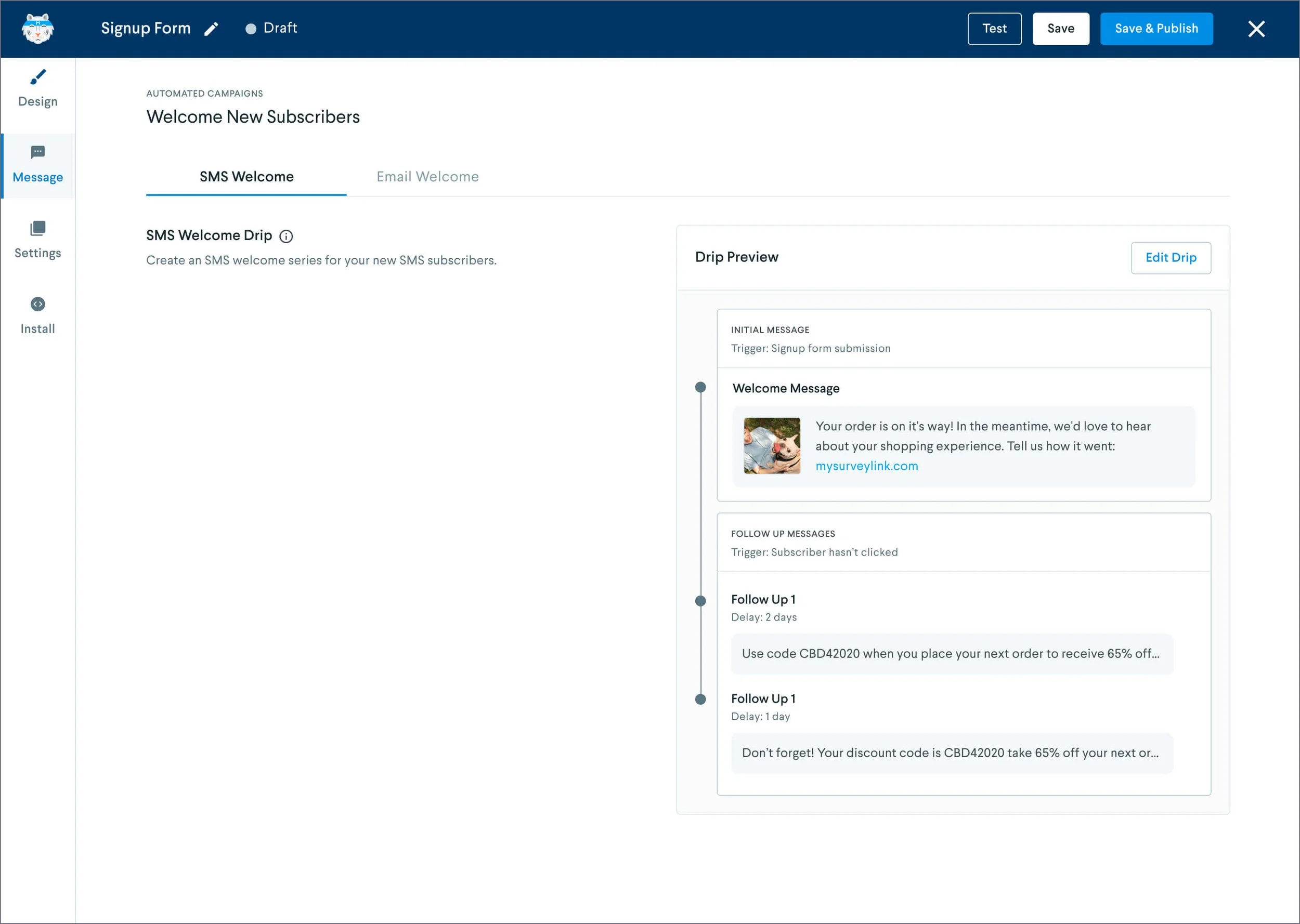
Users can tailor a follow-up SMS and email message when a customer has signed up.
Settings Tab - Integrations
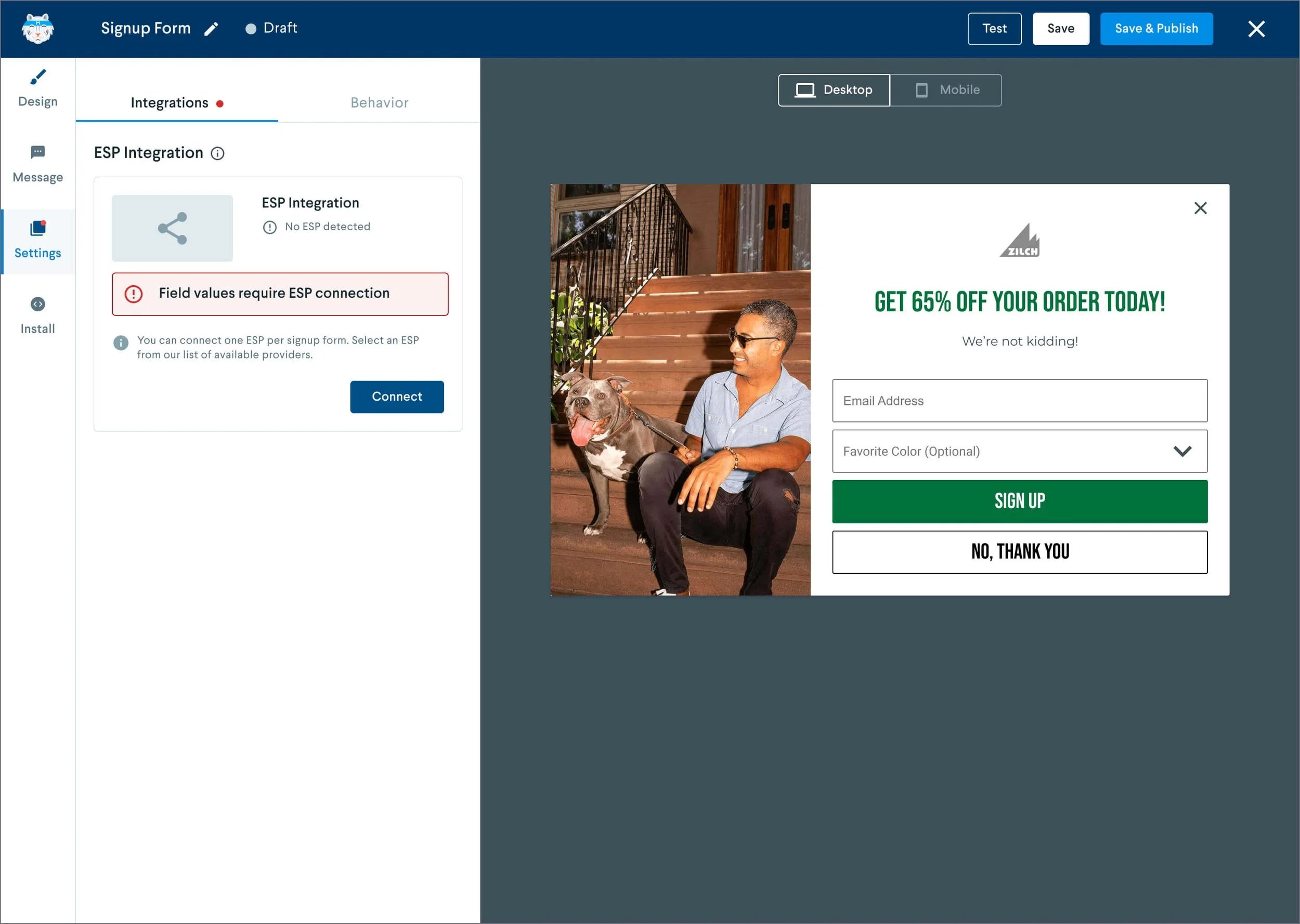
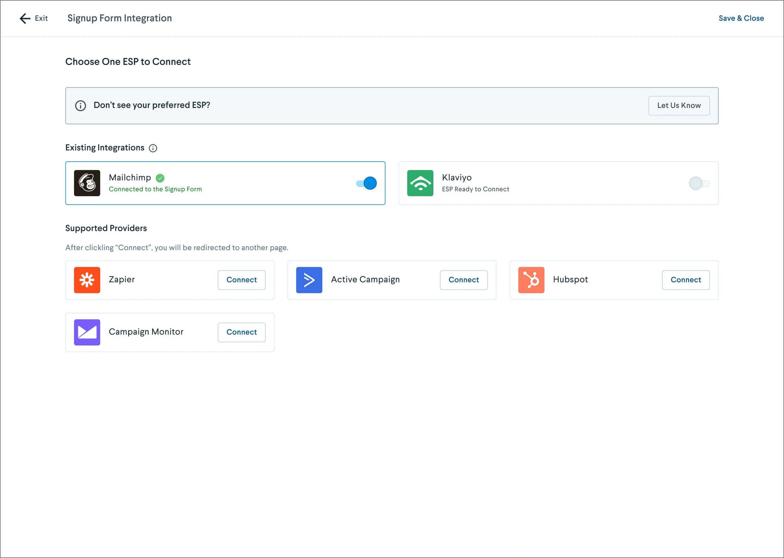
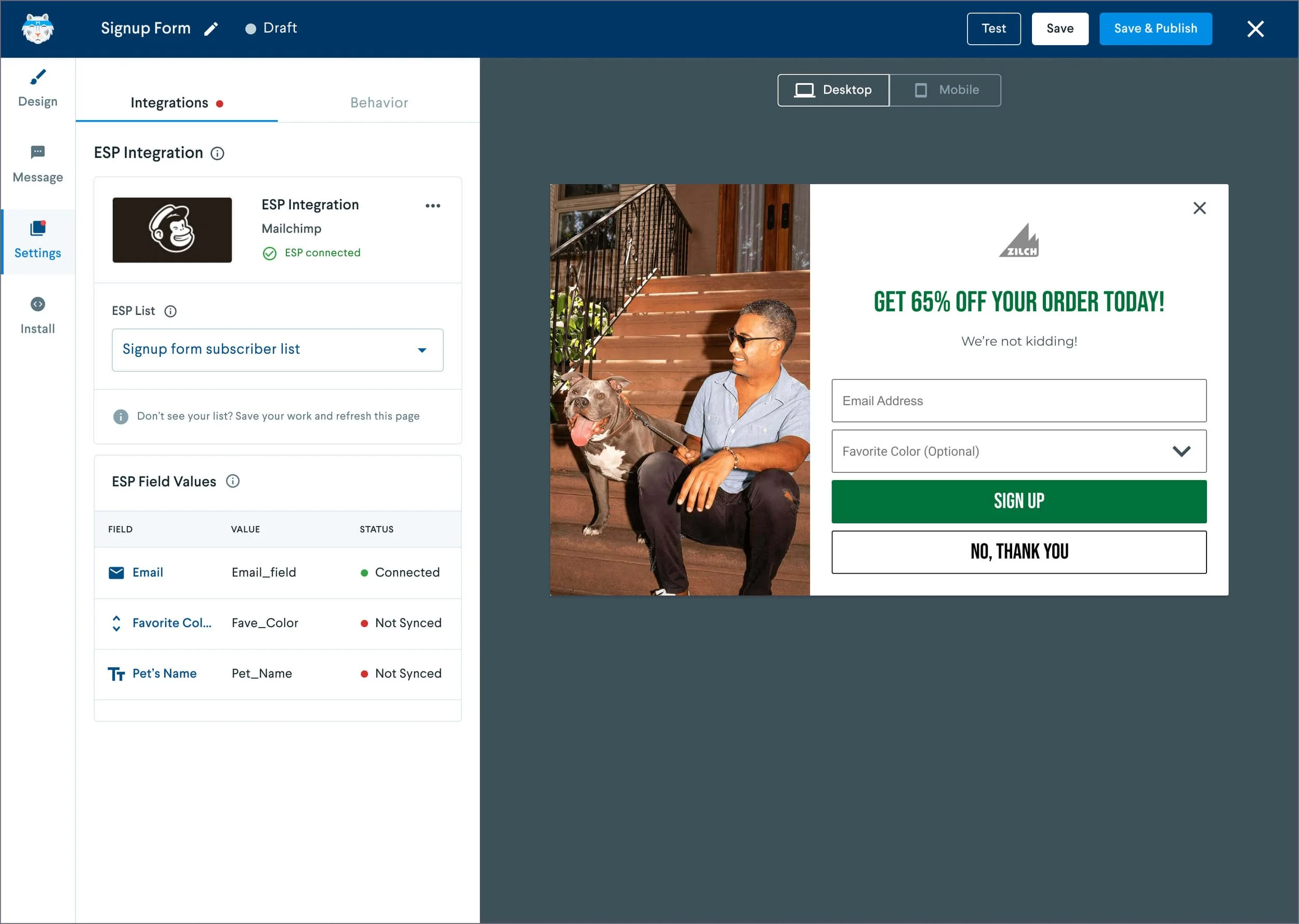
Integration with email service providers (ESPs) allows users to sync field input data with their customer lists.
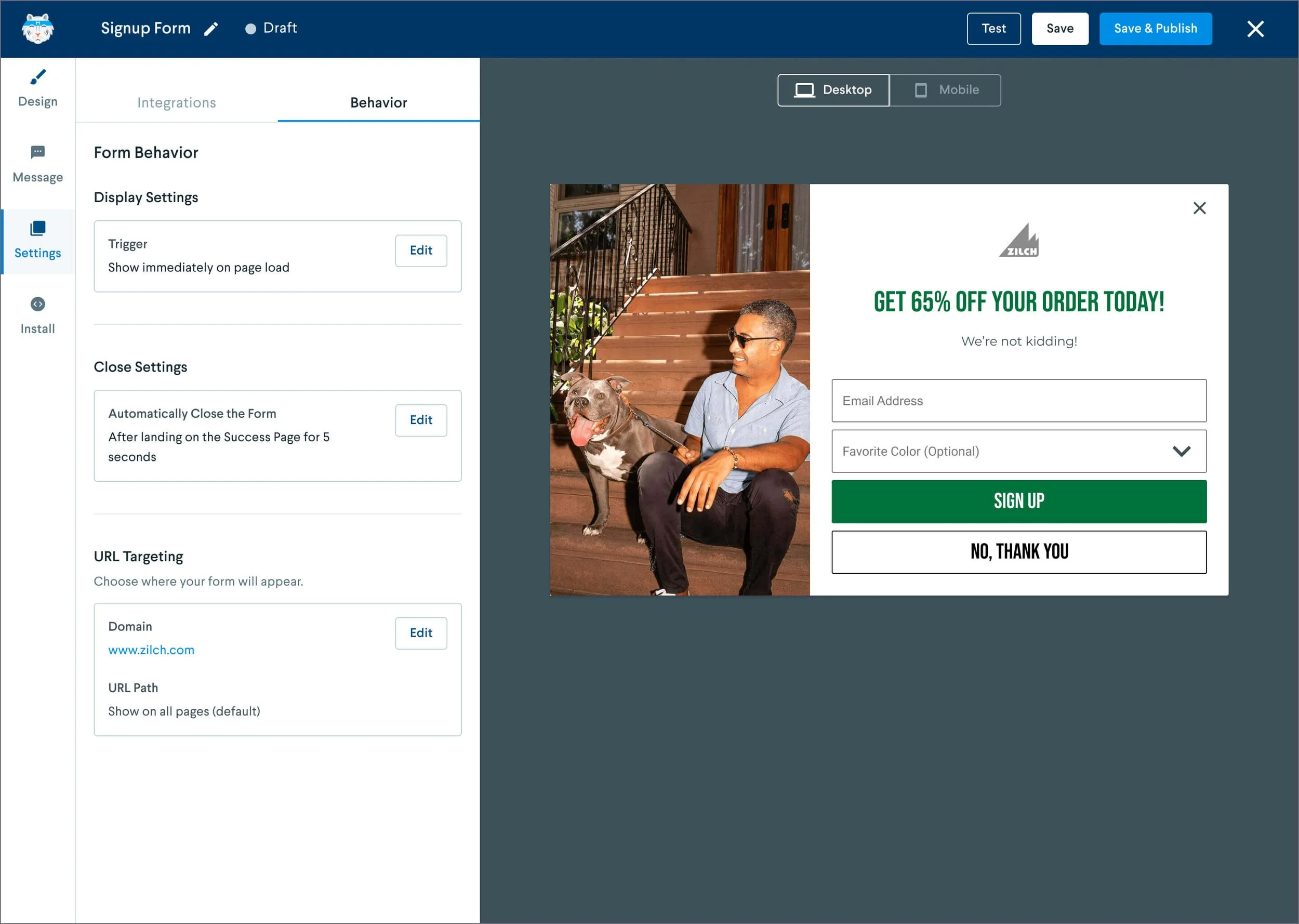
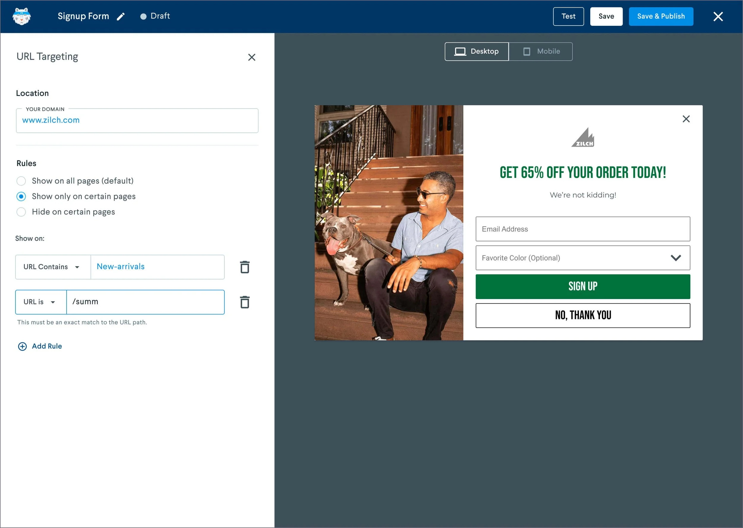
Settings Tab - Behavior
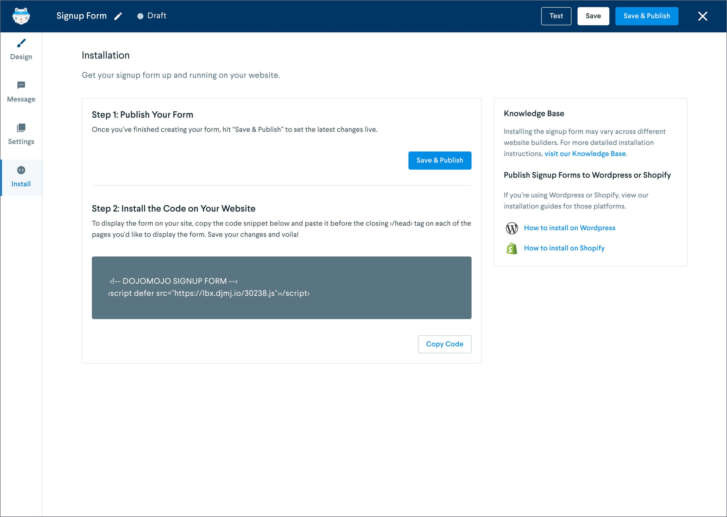
Install Tab
Conclusions & Takeaways
The redesign of the DojoMojo Signup Form Builder not only improved the user experience but also drove tangible results, with completion rates rising from 7% to 26% a month after the redesign. By streamlining the flow, consolidating content and design tasks, and addressing key pain points from customer feedback, we created a more intuitive experience that made building forms easier and faster.
This project showed me the importance of organizing tasks clearly and how small changes, like moving the "Exit" button, can make a big impact on user experience. Listening to users and making thoughtful design adjustments proved essential to boosting engagement and reducing frustration.
Ultimately, this experience reinforced the value of an iterative, user-focused approach in driving measurable improvements that benefit both the product and the business.