Proxima – Tactical Benchmarks
Ideation through business services, Refinement of Systems and processes, and Learning From Failures

Overview
Company
Timeline
Role
Visit
Contents
Intro
Proxima is a growth marketing SaaS platform designed to help direct-to-consumer brands refine their audience targeting and gain actionable performance insights. As we scaled, we identified a need to move beyond managed services and develop software that could drive consistent, scalable growth for our clients. Tactical Benchmarks emerged from this realization as a powerful tool that helps brands assess their digital marketing performance across multiple metrics, leading to smarter decision-making and optimized campaign strategies.
Business Problem
Scaling Beyond Services
By 2024, Proxima had raised a $12 million Series A funding round, primarily due to the success of our custom lookalike audience data, which improved social media campaign targeting by 35%. However, our self-service product was not meeting growth targets, while our revenue from service contracts fluctuated due to unpredictability in the Meta ads marketplace.
This volatility underscored the need for more reliable, scalable revenue streams. We recognized that continuing to rely on managed services, where our internal teams played a central role in campaign strategy, was not sustainable. We needed to evolve into a product-led company, where software—not services—would drive growth.
To achieve this, we set out to build a solution that could operate independently of our internal teams. Central to this goal was onboarding new brands into our platform efficiently, as adding fresh customer data would enhance our audience targeting precision by 30%. A successful transition to a software-driven model promised to increase our Annual Recurring Revenue (ARR) by 50% within 18 months, securing long-term growth in a competitive market.
Opportunity
Transforming Benchmarking Insights
Proxima’s managed services gave us deep insights into growth marketing tactics that worked across various clients. One area that consistently received positive feedback was our approach to performance benchmarking. We saw an opportunity to transform this into a software feature that would empower brands to independently evaluate and optimize their campaigns.

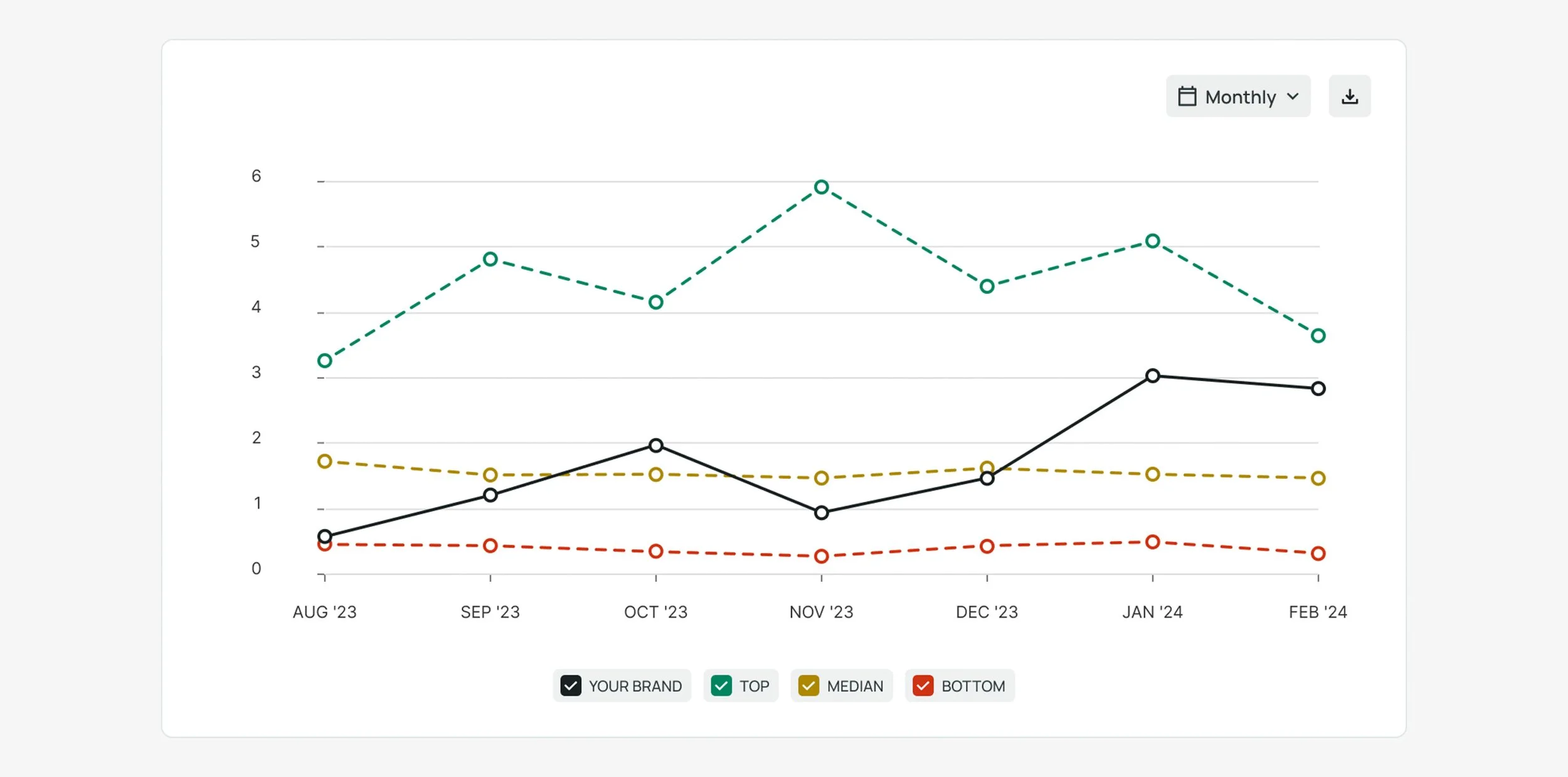
ROAS (Return On Ad Spend) benchmarking chart for a client presentation, by our Data Team. The brand’s ROAS is measured against best, median, and worst performing competitors in our brand database.
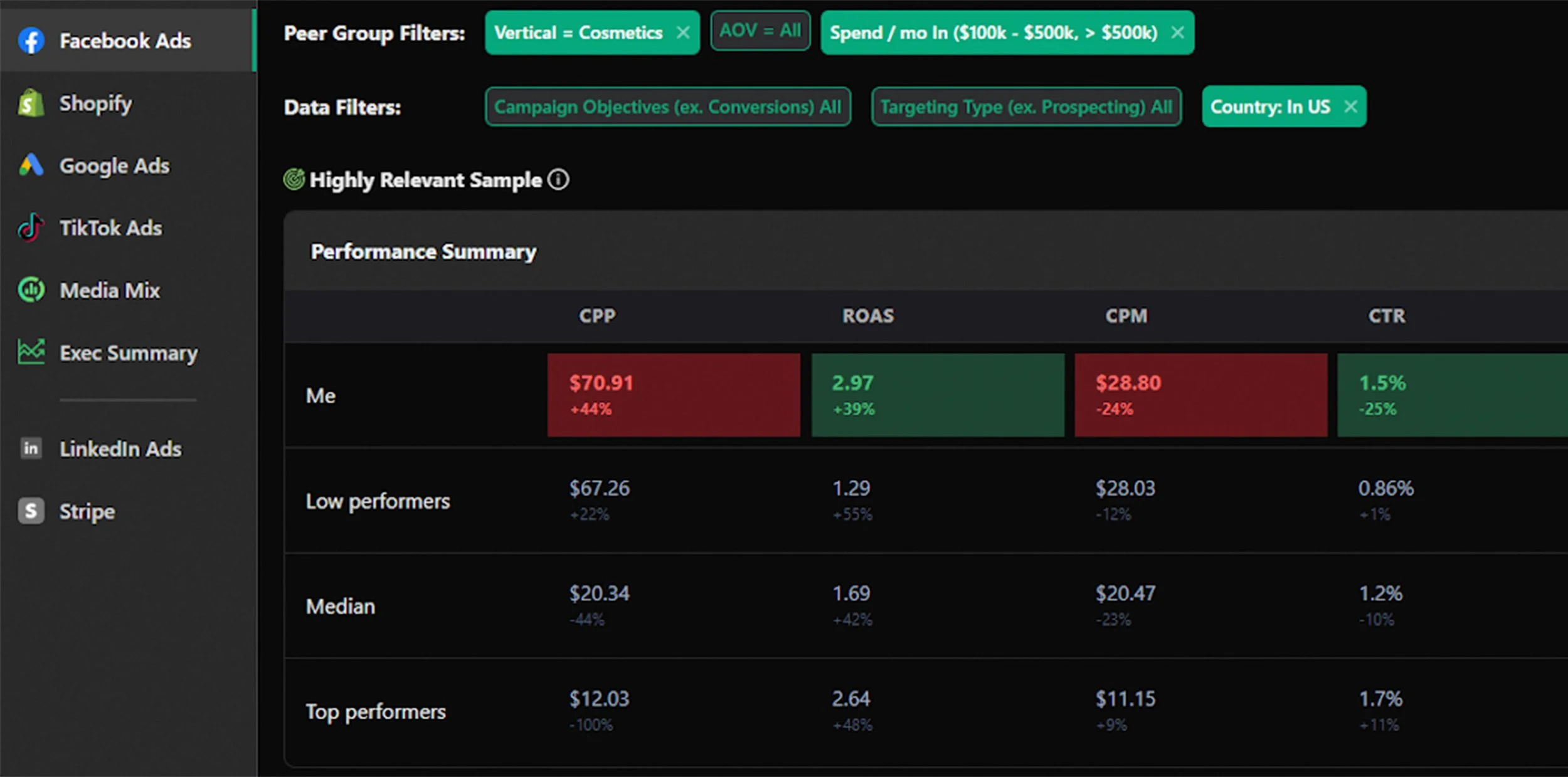
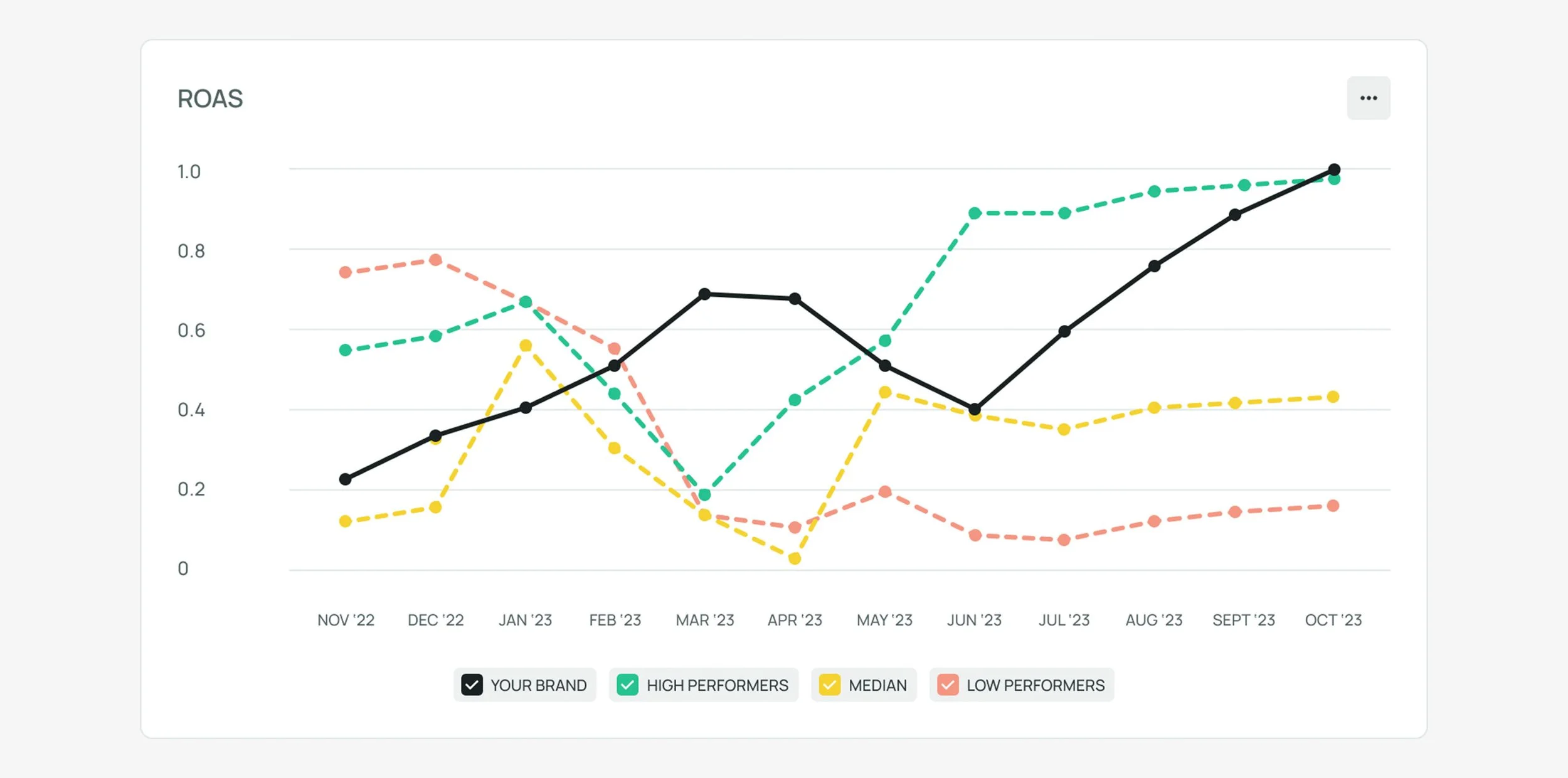
A table-formatted benchmarking tool monitoring multiple metrics, from competitor Varos.
Traditional Benchmarking: A Limited View
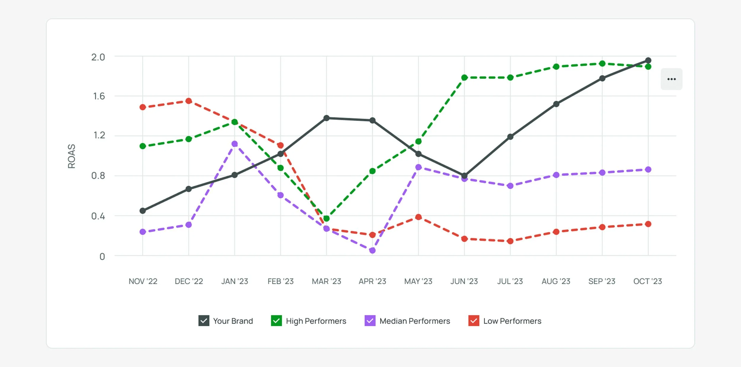
Most benchmarking tools available to marketers focus on individual metrics. For example, they might compare brands’ Return On Ad Spend (ROAS) or Cost Per Acquisition (CPA), but these single-metric comparisons often fail to provide a complete picture of performance. A brand with a high Conversion Rate (1) but a low Click-Through Rate (CTR) (2) may appear less successful, even though it’s effectively converting engaged users into customers.


The Tactical Benchmarks Solution
Our breakthrough came when we began analyzing performance across multiple metrics by cohort. Instead of only looking at individual metrics in isolation, Tactical Benchmarks anchors brands by cohorts—high, median, and low performers—based on Click-Through Rate, in this example.
Then, we analyze these cohorts’ performance across other metrics, like Conversion Rate. This method revealed an important insight: high Click-Through Rate brands don’t always have high Conversion Rates (3), whereas brands with fewer clicks often excel at converting those clicks into sales (4), confirm their approach is effectively attracting serious buyers.

We called the feature the Anchor Function. This nuanced view helps brands identify which of their campaigns are truly effective, allowing them to refine their strategies accordingly. Tactical Benchmarks became a game-changer, enabling clients to assess and optimize their campaigns across multiple dimensions, resulting in better marketing decisions.
The Team
I led UI and design system decisions, and assisted with prototyping and user testing. I also worked closely with engineering and QA during development.
Alexa, Director of Design, led research and testing, and assisted with UI and design system decisions.
Luiza, our product manager, supported competitive research and user interviews.
Clint, head of Product Marketing, contributed to competitive research and handled product writing.
Colin, our Director of Product, developed our roadmap and set business goals for the team. He also brought his deep knowledge of digital marketing trends to the project.
Our Data Science team also provided guidance throughout the process.
Our Goals
Release an MVP traditional benchmarking tool
Release an MVP version of Tactical Benchmarks
Use the project to begin the transition into our improved design system, through the introduction of new components and design tokens
Establish a foundational system for data visualization that aligns with the third-party library used by front-end engineers
Expand and improve on our research and validation processes
Take advantage of a longer, unique development cycle to refine the working process between design and engineering teams
Design Process
Introducing the UnFamiliar
Introducing a new approach to benchmarking tools posed a challenge.
Alongside Tactical Benchmarks, a traditional benchmarking tool was still necessary, as it remained a standard tool for everyone in growth marketing. During early exploration, two key questions emerged:
Should traditional and tactical benchmarks be combined into one tool or kept separate?
The Anchor function is a completely new and novel way to interact with benchmarks—how do we effectively educate users about it?
Wireframes & Concept Exploration
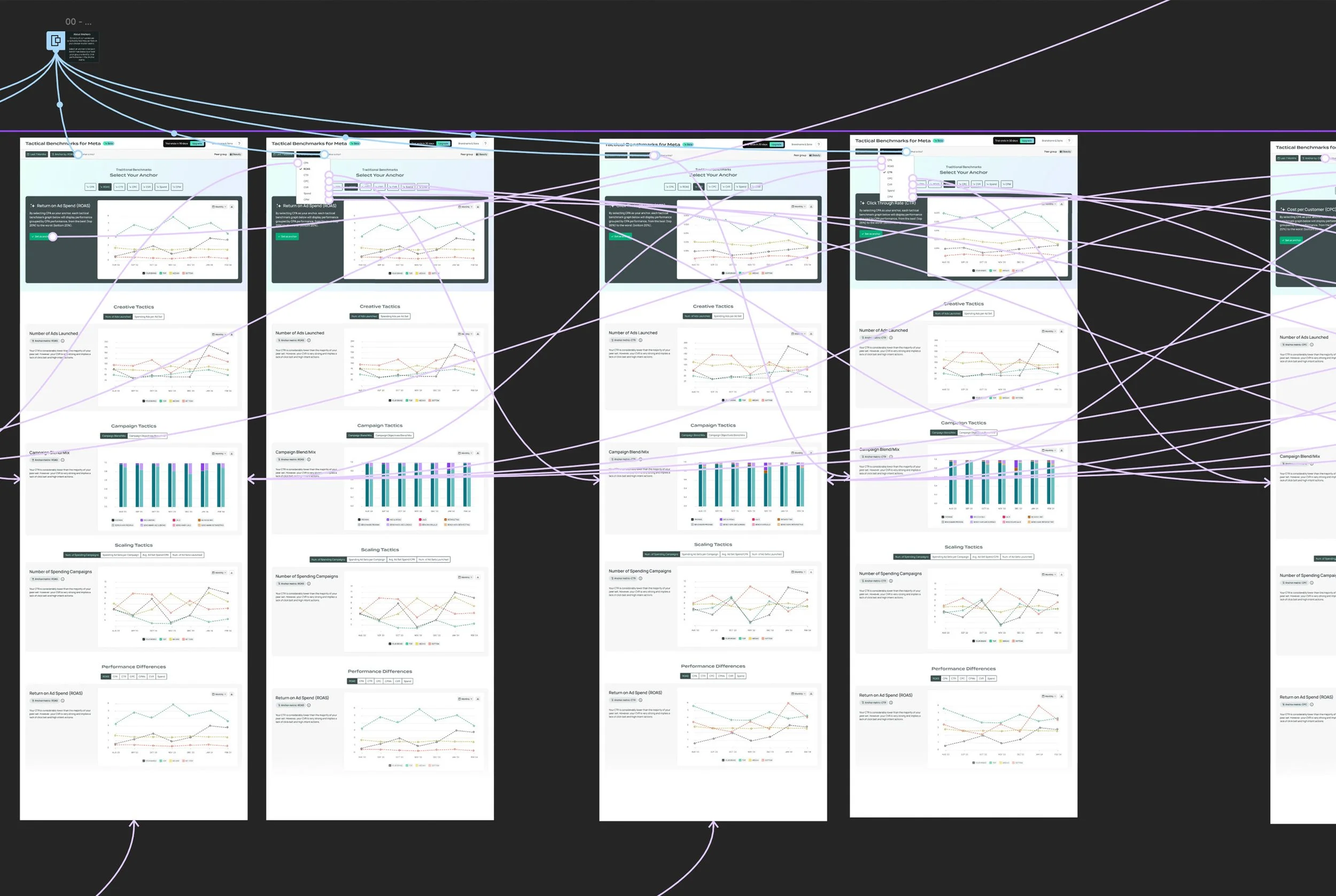
Our initial wireframes, developed under the leadership of Colin, our Director of Product, combined traditional and tactical benchmarks on the same page, separated by tabs. This layout was designed to meet the expectation of users seeking traditional benchmarks while also providing an opportunity to introduce them to Tactical Benchmarks. Traditional charts were benchmarked by standard KPIs like ROAS, whereas tactical charts were categorized contextually into Performance Differences, Creative Tactics, Whitelisting Tactics, and more.
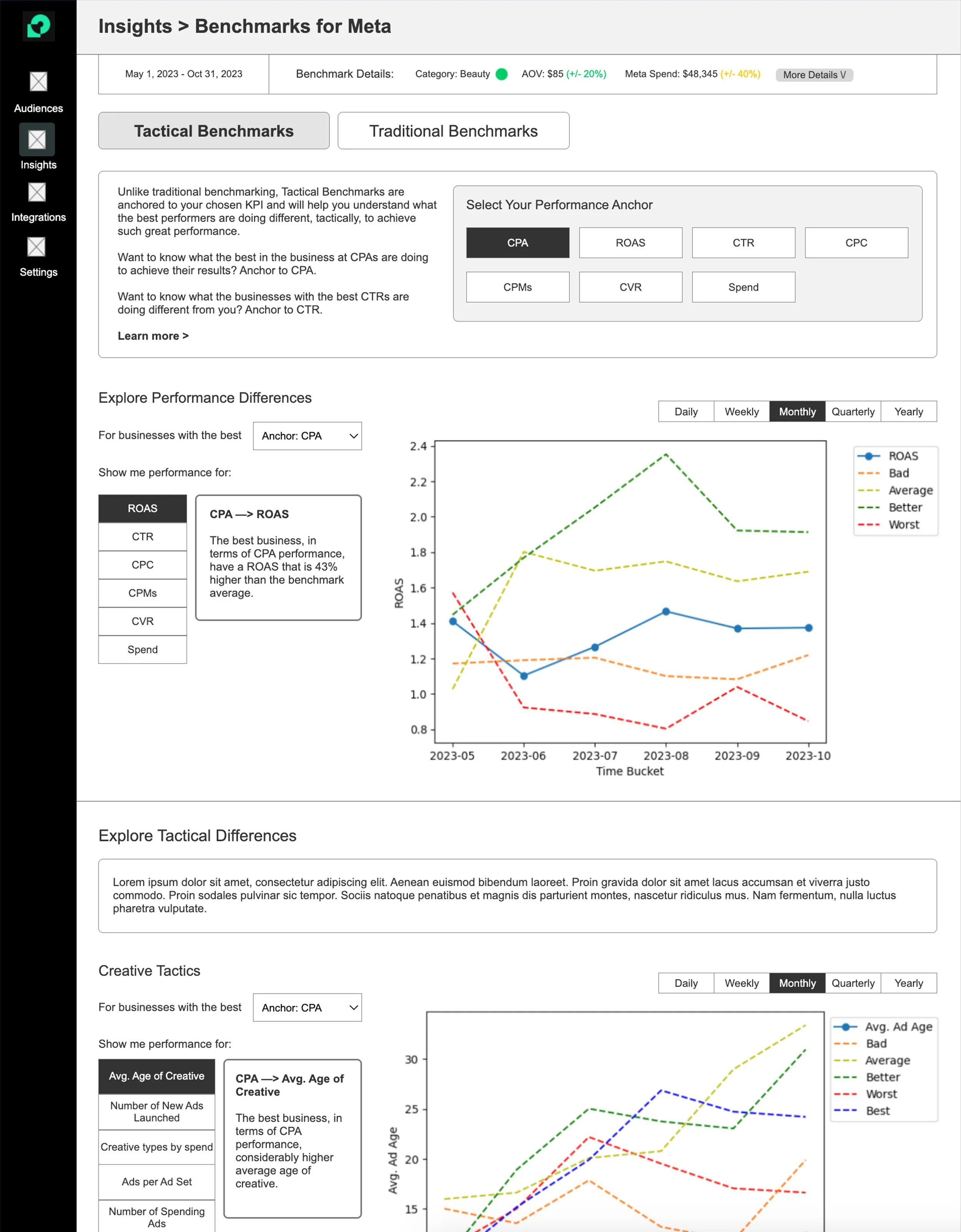
At the top of the page, a panel displayed key information about the brand's peer group—the set of brands used for benchmarking. Our data science team identified the shop category, the group's Average Order Value (AOV), and average Meta spend as the most crucial metrics. Future iterations will offer users the ability to expand this view to access more detailed metrics as our backend capabilities grow.
After further iteration, the design team grew concerned that combining both tactical and traditional benchmarks in the same view could overwhelm or confuse users. Feedback from internal teams supported this concern. Consequently, we explored the option of splitting the tools across separate pages.

Early wireframe of a standalone Tactical Benchmarks, with the sub-navigation drawer and page-level tab navigation.
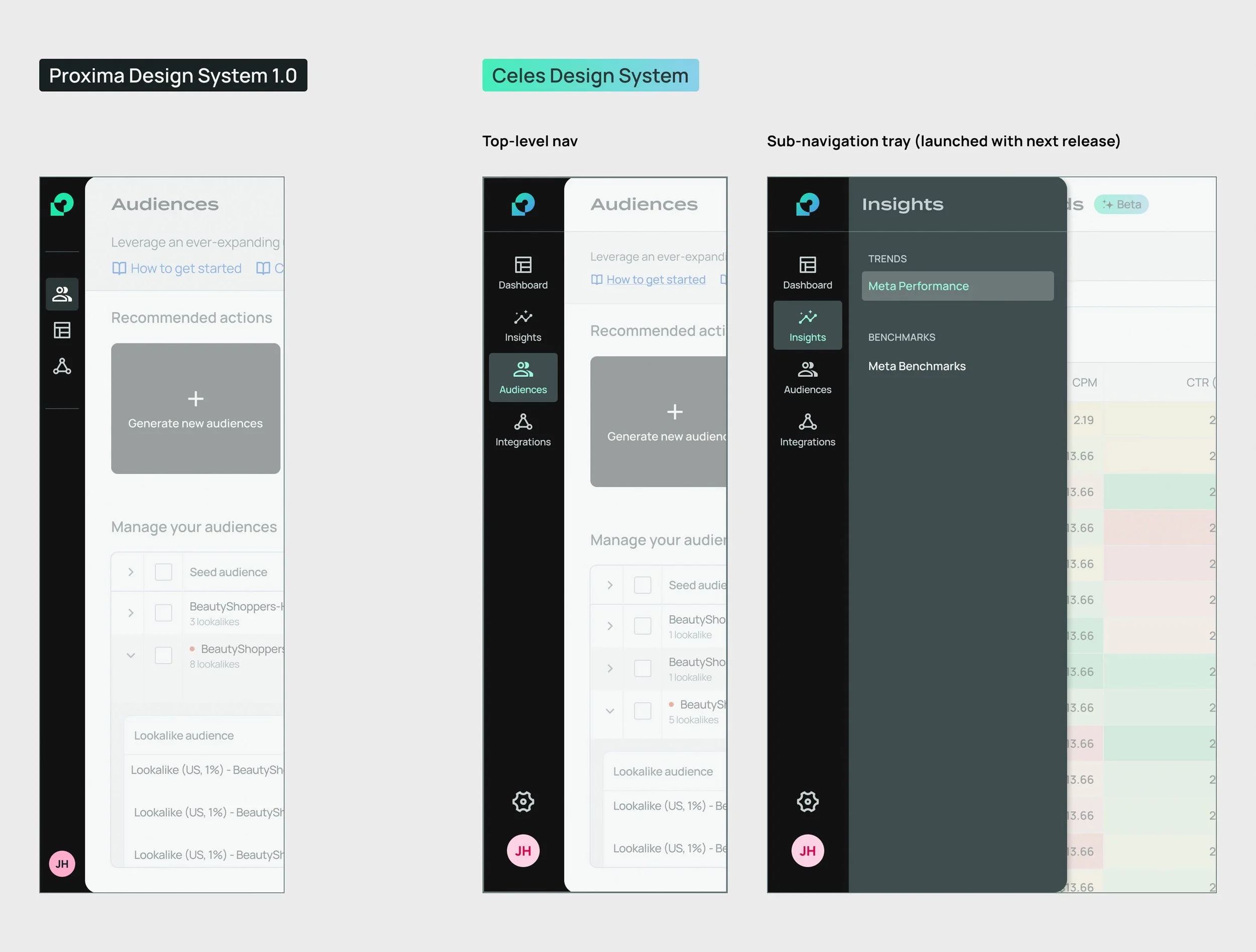
This naturally led us to consider implementing a sub-navigation menu. Our existing top-level navigation was not designed to accommodate an expanding suite of similar products, so we began grouping them into broader categories, such as Insights/Tactical Benchmarks and Growth/Audiences. Both the sub-navigation UI and naming structure required exploration.
Additionally, we consolidated the various benchmarking charts into a page-level tab navigation.
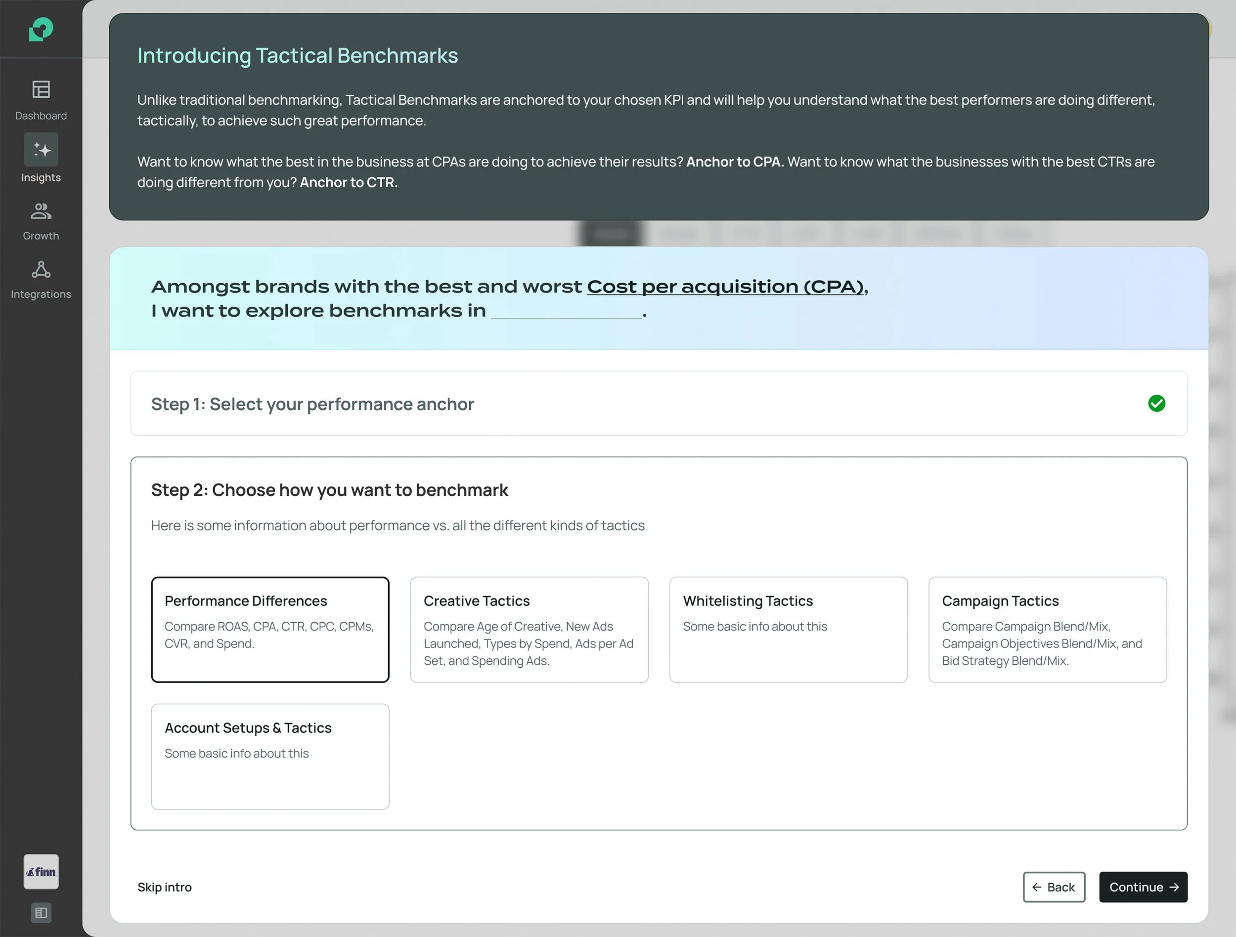
If Tactical Benchmarks were to be a standalone tool, it would need an onboarding experience that could clearly explain the concept of a performance anchor to first-time users, many of whom would likely be unfamiliar with the term.
It's worth noting that after testing within our internal team, working amid a sea of marketing jargon, confusion sometimes arose.
Drawing inspiration from onboarding flows in other SaaS products and the conversational style of AI tools like ChatGPT, I devised a rough concept for an onboarding wizard. This wizard would guide users through a fill-in-the-blanks statement, helping them set expectations step by step.
Resource Constraints and Redefining MVP
Ultimately, we faced the reality of limited time and resources. Most of our engineers were fully occupied with backend and platform infrastructure tasks, while the frontend engineer dedicated to our project was deeply engaged in integrating Highcharts, our chosen third-party data visualization library, into the codebase.
The constraints:
Splitting traditional and tactical benchmarks into two locations would significantly expand the project’s scope, requiring a redesign of our top-level navigation to include a sub-navigation drawer.
Although the team liked my concept for an onboarding wizard, developing a new complex modal component would also add too much scope to the MVP.
As a result, we put these enhancements on hold and opted to release a more streamlined MVP that combined both traditional and tactical benchmark tools, similar to the original wireframe concept.
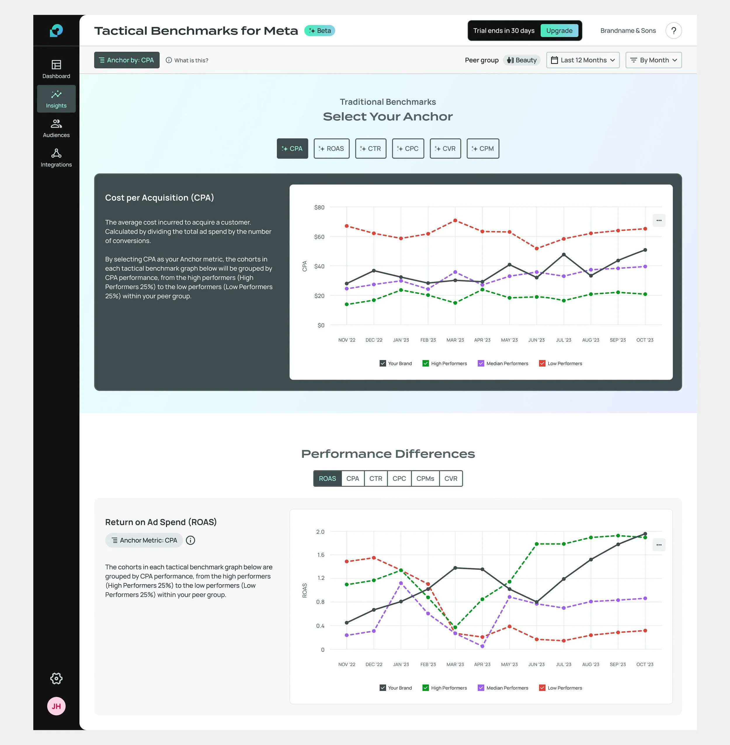
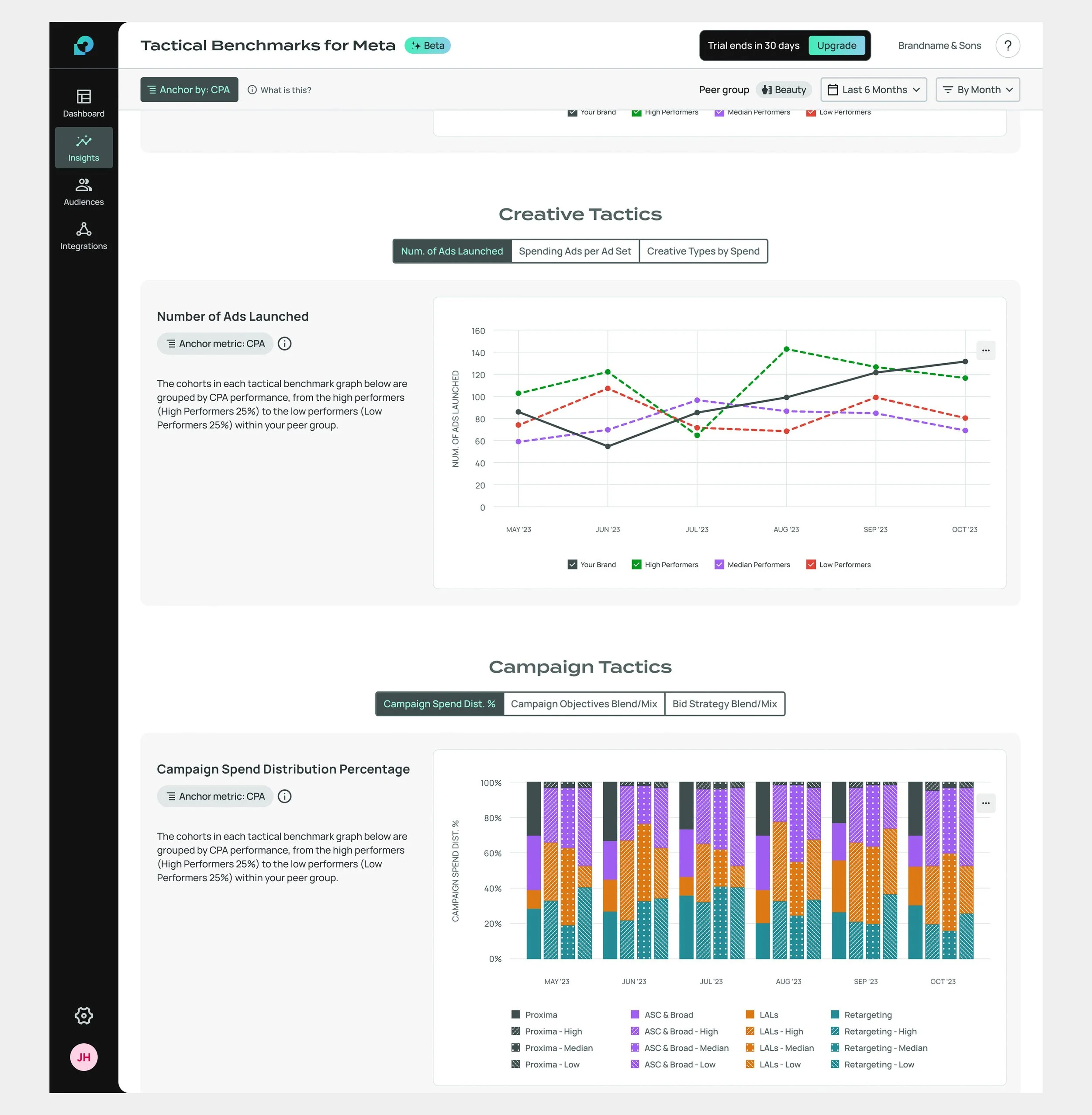
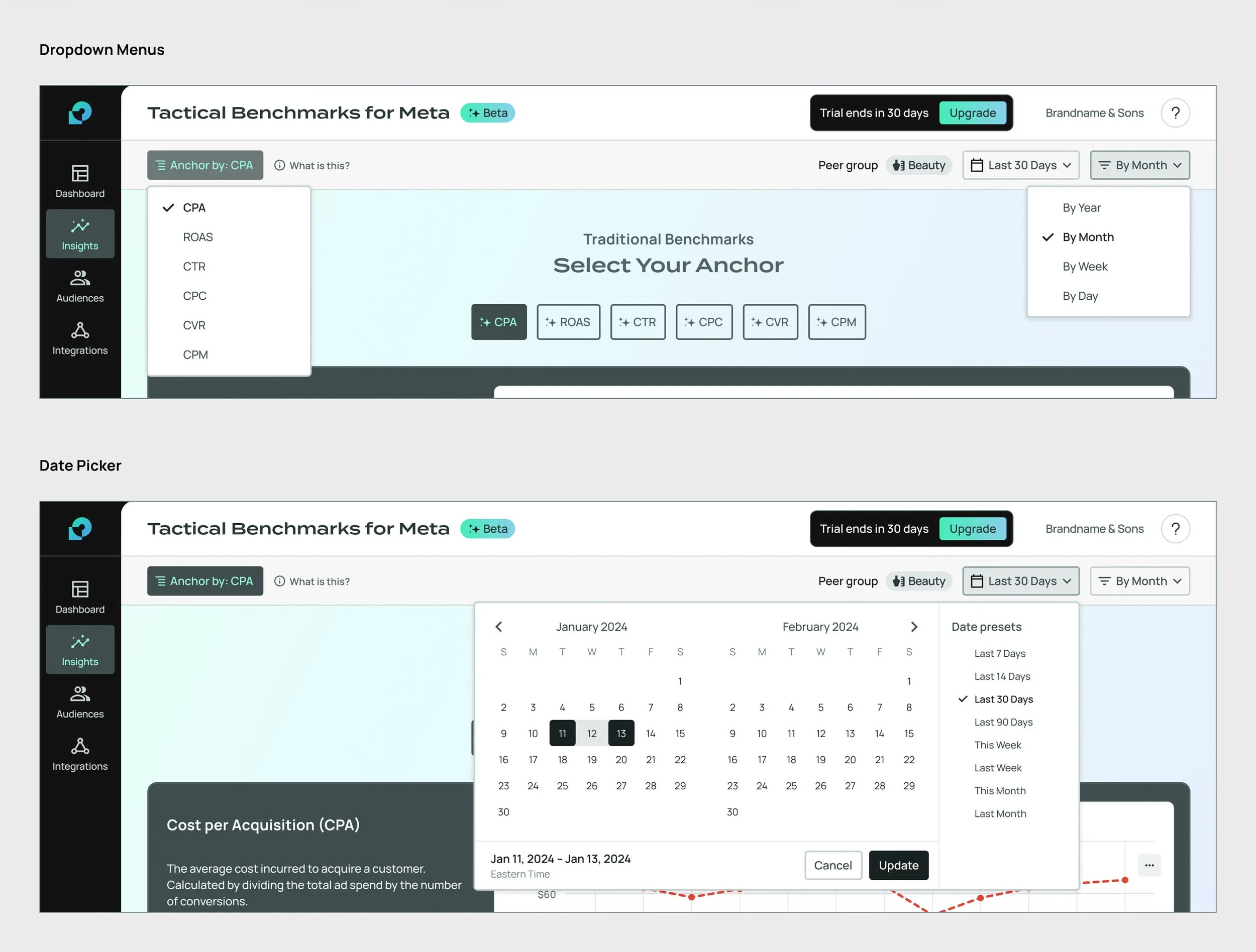
To keep the MVP as lean as possible, we chose to forego the previously explored tabbed navigation for the tactical charts. Traditional benchmarks would appear above the fold. Familiar charting allowed users to explore traditional data while providing context on how Anchors worked. The KPI selected for benchmarking would also serve as the active anchor for the tactical charts below.
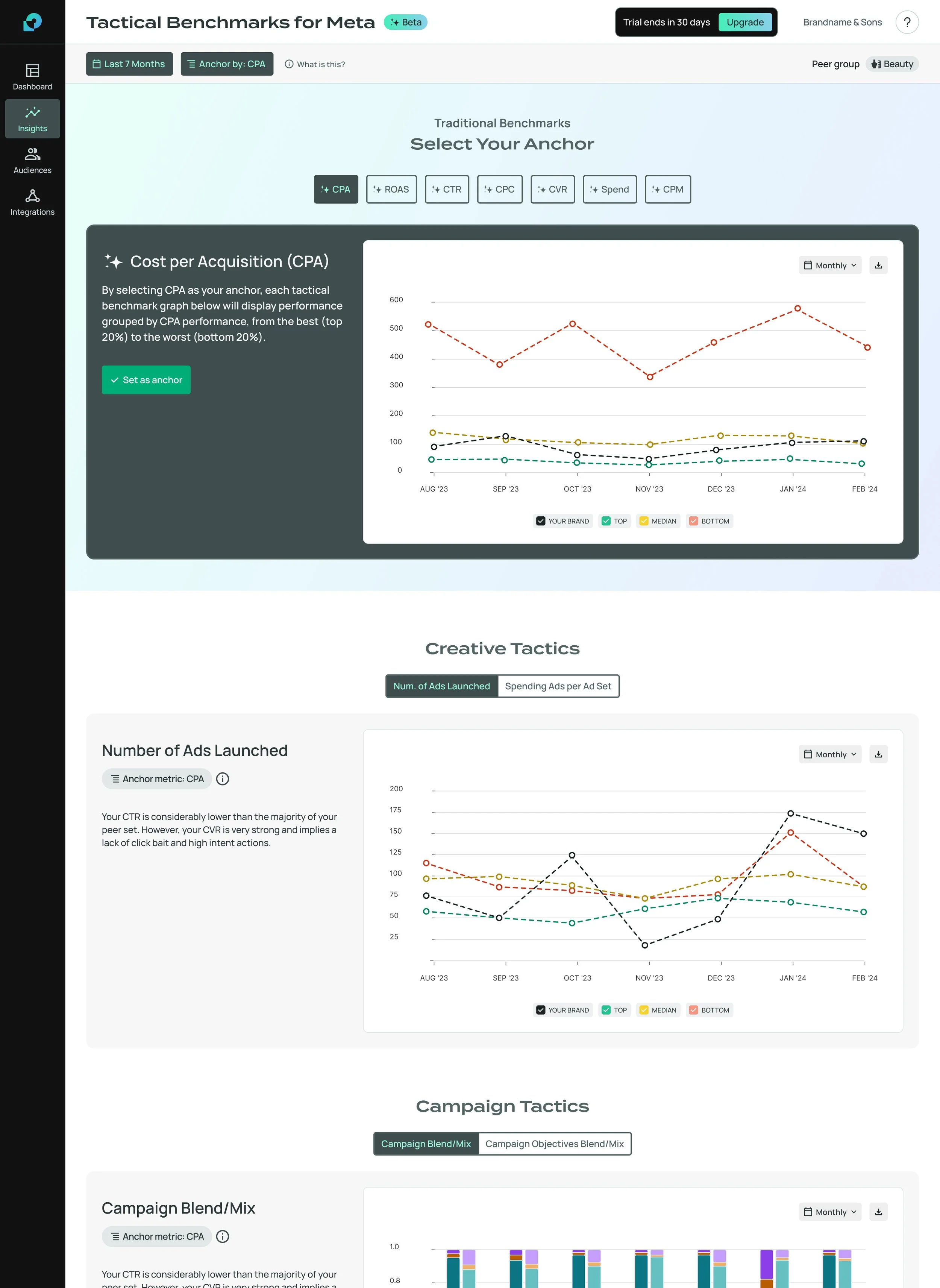
Prototype-ready design—data visualization system still being worked out.
Design System Improvements
The design team used the Tactical Benchmarks project as an opportunity to make critical updates to our design system and improve the alignment between our Figma system and the developer component library. We needed to update components, consolidate styles, and reassess the way objects and surfaces interacted. I was tasked with leading this initiative.
Since this was our first design to use charts instead of tables for data visualization, we also laid the foundation for our data visualization system, anticipating future data-rich features.
All this work culminated in version 2.0 of our design system, which we named the Celes Design System.
Insert Tokens
In Proxima's early days, our design system was constantly evolving. We adjusted colors and rethought text styling frequently. Despite our intentions, we never implemented a token-based naming system for UI styling. For example, button fills were linked to global color labels like Neutral 90, rather than descriptive names like $button-primary-default.
As the library grew, it became harder for designers and developers to track the logic behind styling choices. It was clear we needed an overhaul, so our first step was to audit our entire component library to establish token logic.
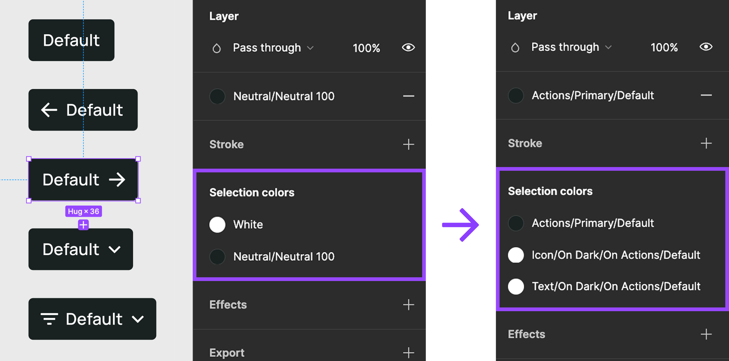

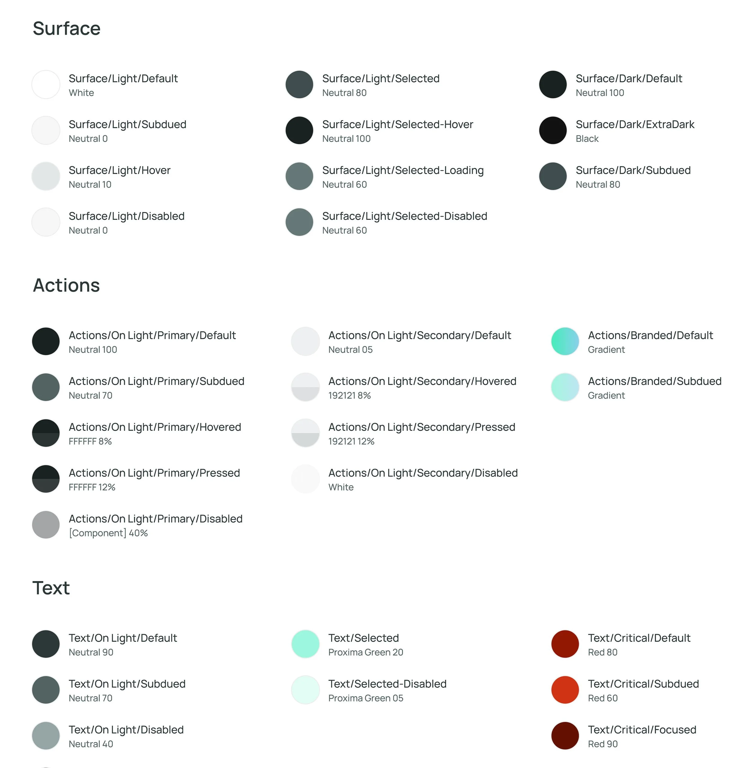
Global color styles consolidated into semantically-labeled tokens.
One key change was in how we rendered component interaction states. Previously, states like Hover or Disabled were represented by solid color transitions. For instance, primary action buttons would change from black to light grey when disabled. While this worked on a white background, it created contrast issues on similar-colored surfaces, and looked awkward on colors like green in a “Success” state.
I introduced transparency-based interaction tokens, where low-opacity color was layered over components for Hover and Pressed states, and Disabled components were partially transparent. This approach improved consistency and contrast across different colors.

Charting New Territories
Previously, data in Proxima was displayed only through tables. Since our platform focused on launching and monitoring audiences and campaigns, early versions lacked reporting or charting features.
Designing our first data visualization system involved collaboration with the design team, obtaining stakeholder and marketing approval, and ensuring feasibility with our front-end engineer for Highcharts. We chose Highcharts for its data visualization capabilities and ease of customization to our design language, which at the time was based on a proof-of-concept design I had made previously.
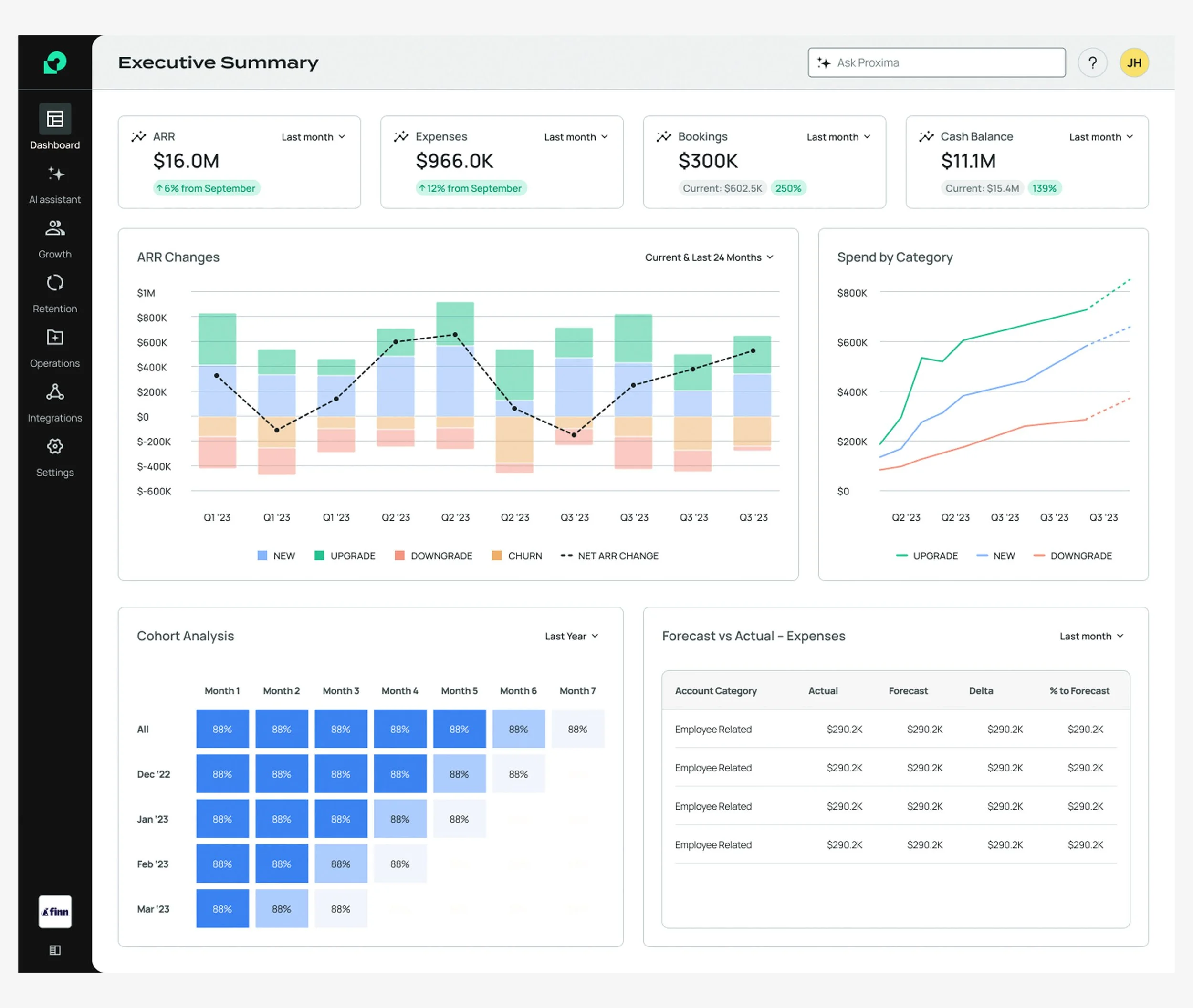
A dashboard design from a previous exploration of future concepts and design system updates.
Initial designs were faithful to our proof-of-concept, using soft colors and high-contrast black to represent user data. During user testing, we simplified the charting and refined legend controls for toggling lines.
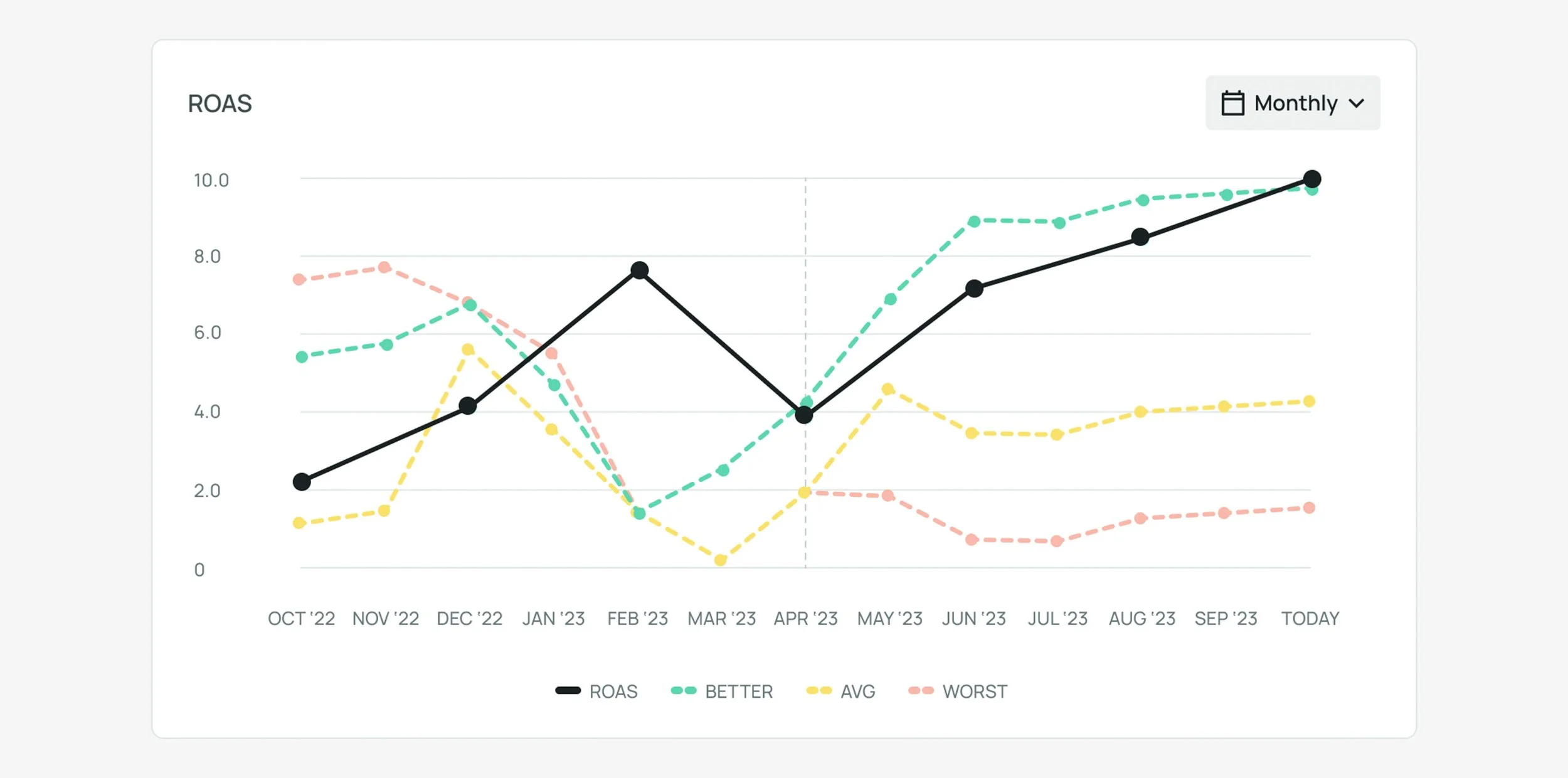
We later streamlined chart lines and used bolder colors. Bar charts were introduced to convey benchmark data, such as campaign spending. However, even these hues of green, yellow, and red proved difficult to distinguish, especially for vision-impaired users.

Data highlight concept.

We replaced yellow with purple for median data and darkened all colors to improve contrast. We also updated our color system to use more “default” and “system-like” reds, greens and yellows, removing branding influences. For bar charts, we used patterns for visual distinction instead of lighter colors.


More Constraints
Our engineer faced challenges with Highcharts, such as difficulties with rounded corners and legend background colors. We simplified the legend design and placed the actions menu button at the right edge of charts due to constraints. Additionally, styling the menu in our visual language proved challenging, so we used Highcharts’ default styling for now.
User testing, Interviews, and Validation
With our MVP design reaching a plateau, we were ready to move into the user research phase.
Previously, user feedback was limited to occasional and informal Q&A sessions with trusted clients. For Tactical Benchmarks, the design team advocated for more structured research methods. We aimed to validate our designs alongside production.

Given that we would test with individuals familiar with growth marketing, it was crucial to use realistic data. Our prototype included various benchmarking charts with different metrics and anchor options, leading to numerous data visualization possibilities. Our data science team would guide us in making the data credible.
We chose Useberry as our testing platform and planned two sets of tests:
Moderated Testing: Thorough interviews with Proxima consultants, trusted clients, and friends experienced in growth marketing (7 participants).
Unmoderated Testing: Participants from Useberry’s pool with digital marketing experience (~15 participants).

Click-based heatmap, unmoderated prototype testing.
Both tests aimed to assess whether users could understand the anchor function and apply it to benchmark data. Participants were asked to select an anchor, apply it to tactical benchmark charts, and provide feedback on data comprehension and overall experience.
Moderated tests included detailed interviews and a card sorting exercise. Interviewees provided feedback on the anchor function, graph readability, and navigation. We also inquired about their role, experience with growth marketing, tool usage, influence on campaign spending, and key information needed for their work.
The card sorting exercise involved sorting sets of cards by priority, evaluating categories such as benchmarking metrics, types of charts, and peer group data.
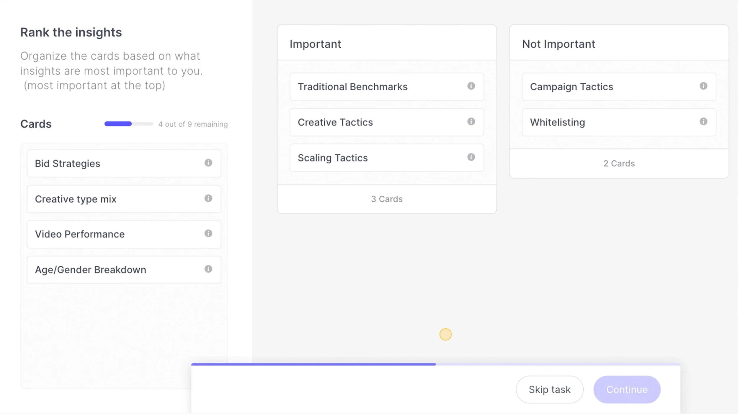
Card sorting exercise from the participant’s view.
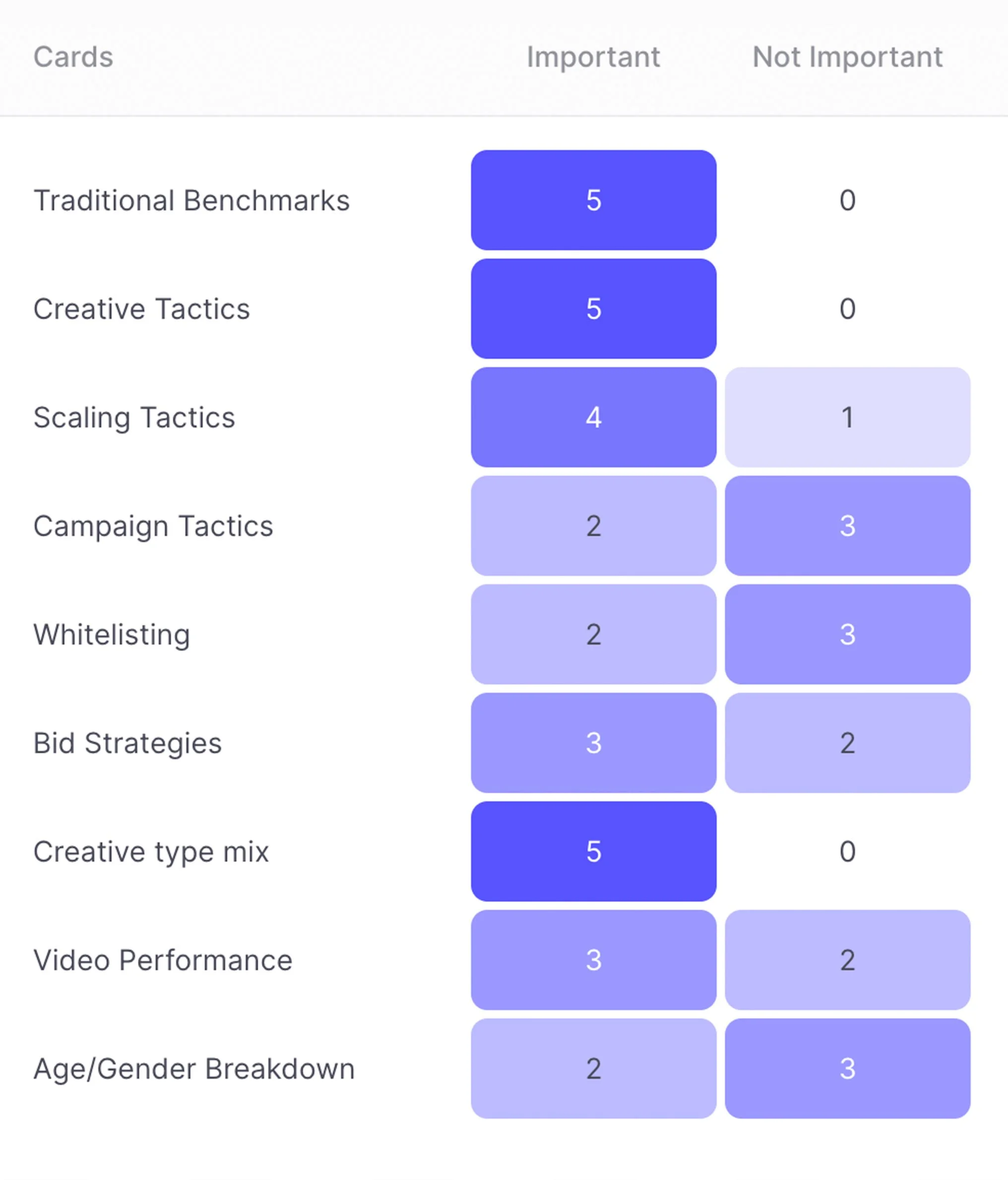
Cards sorted by priority for benchmark KPIs and chart categories.
Processing the Feedback
To identify actionable opportunities from the feedback, the team conducted an affinity mapping exercise. This focused only on the feedback from the moderated tests, as those questions were more detailed.
We prepared by having Alexa, Luiza, Clint, and I review AI-transcribed audio recordings and organize answers into a Google Docs spreadsheet. In Miro, we created post-its for participants’ thoughts and highlighted the most insightful points.
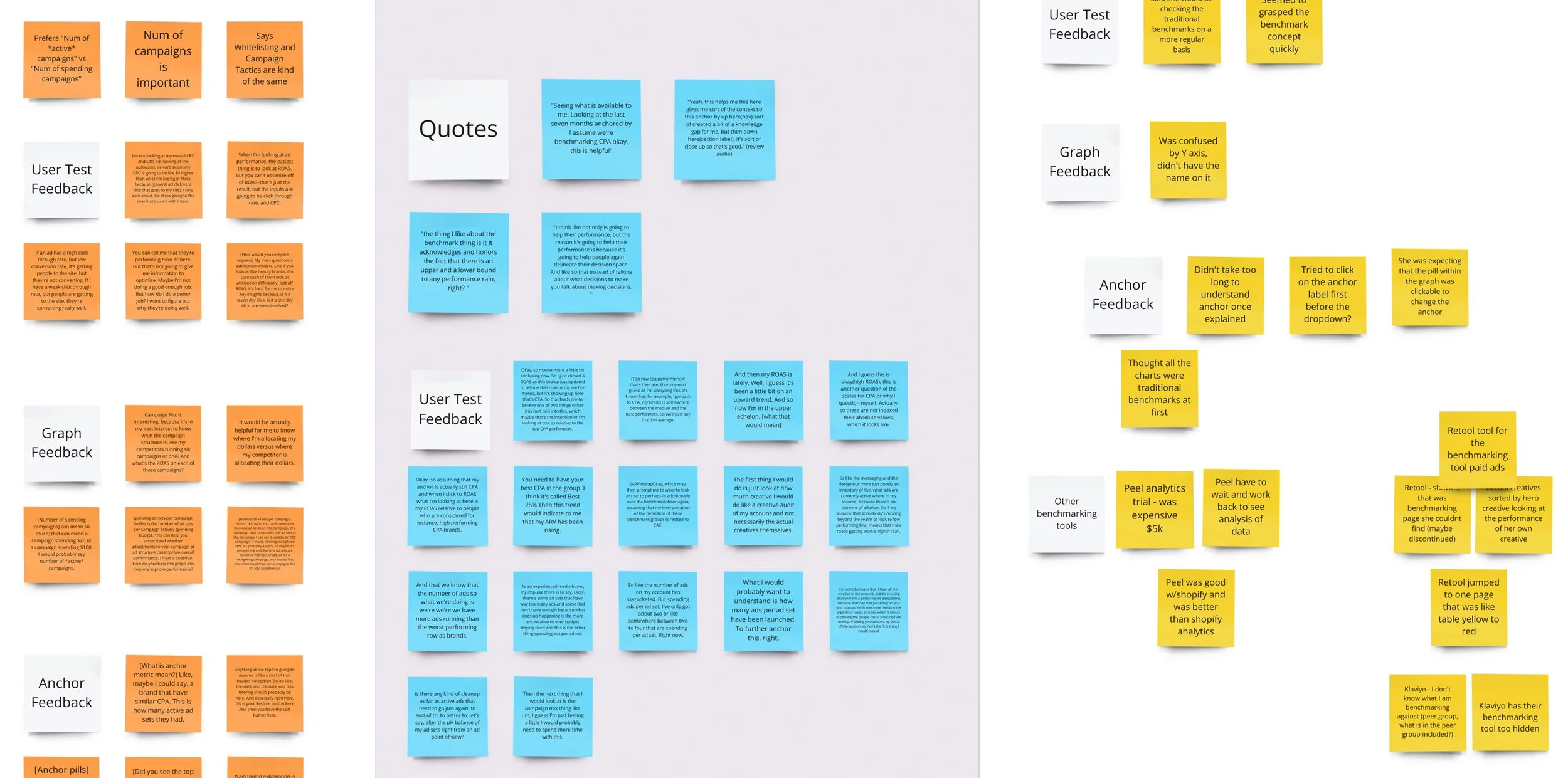
We then analyzed these standout thoughts and grouped them into common themes. As a team, we agreed on the most significant themes.
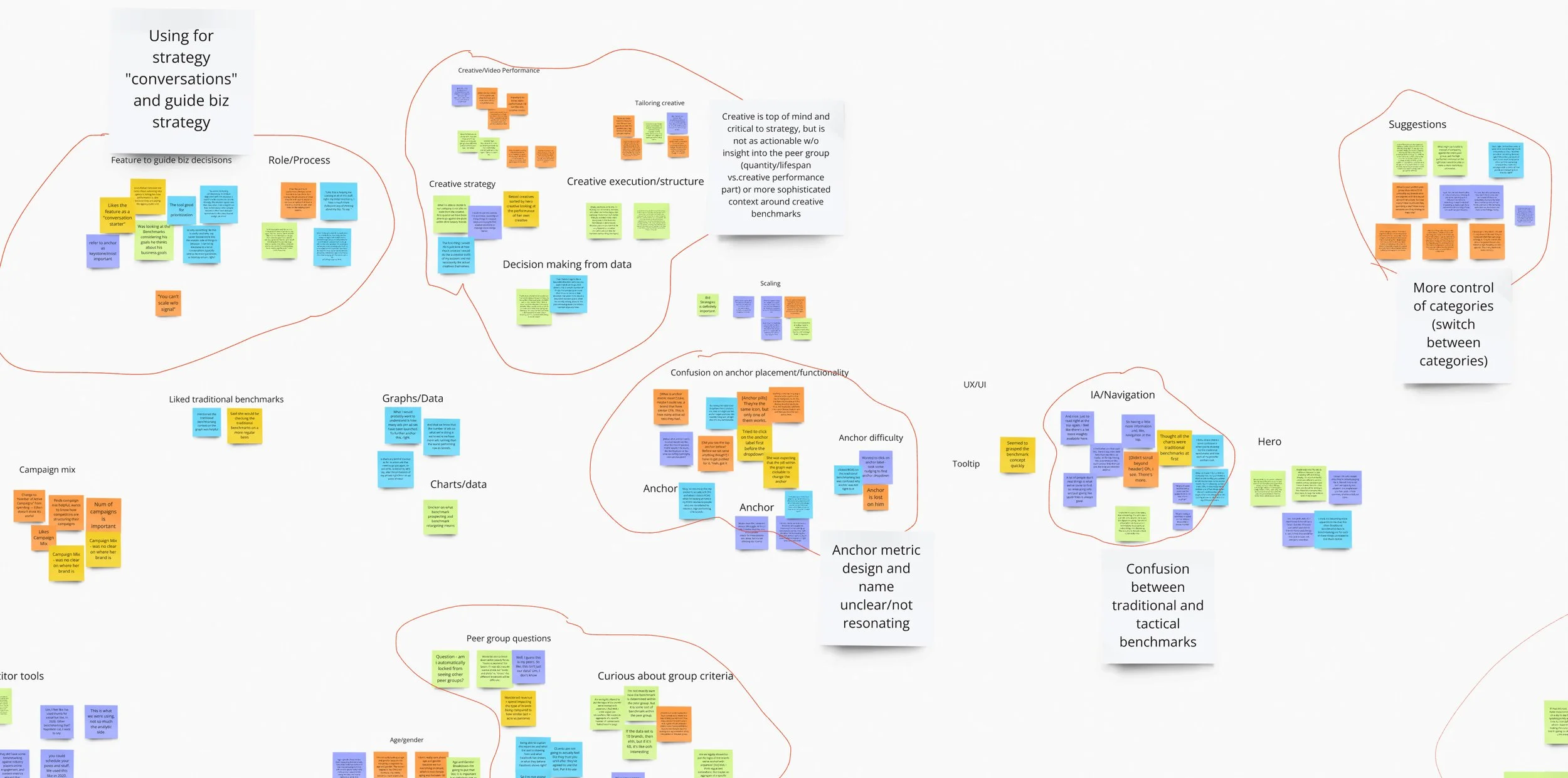
The feedback was valuable, with some expected issues and new insights:
Confusion from Design Choices: Our suspicion that placing a traditional benchmarking tool above the tactical charts would cause confusion was confirmed. The “universal” anchor setting, which did not affect traditional charts, also confused users.
Navigation Issues: Participants were not used to scrolling through a page for additional charts and often didn’t realize more charts were available. They suggested using tabs or other forms of sub-navigation, reinforcing our previous instincts.
Limitations and Trust Issues: Some frustration stemmed from limitations likely universal to all benchmarking tools, due to legal or privacy reasons. Participants expressed distrust in data from anonymous peer groups, preferring brand names or at least the number of brands in each group.
Desire for More Control: Many participants wanted more control over their peer group, such as the ability to switch between ecommerce categories or apply multiple categories. This was especially relevant for brands with overlapping customer demographics, like haircare and beauty.
Frustration with Marketing Tech: Some participants felt that benchmarking tools were less valuable compared to insights into competitors’ creative strategies. This feedback led to broader reflections on the future of our platform and what products might be worthwhile to develop.
Final Designs
Components
Header Bar – Before & After


Top-level Navigation – Before & After

New Components


Conclusion
With the MVP of Tactical Benchmarks released, it became clear that significant improvements were needed to make the tool more viable. Early users appreciated having an integrated benchmarking tool within Proxima and praised its design compared to competitors. However, many struggled to grasp the concept of Tactical Benchmarks and the functionality of the Anchor.
To make Tactical Benchmarks a standalone product, we faced two options: either separate Traditional and Tactical benchmarks into distinct tools or enhance the existing tool with a more cohesive user experience. While the Design team was eager to implement these improvements, they had to be pushed further down the roadmap.
Despite the pause, the team’s investment in Tactical Benchmarks laid a valuable foundation for future insights and reporting features, including:
New reusable components
A robust data visualization system
Transition to the Celes Design System, ensuring better parity between the Design and Engineering component libraries
Crucial engineering investment in the data pipeline
These enhancements would make future releases quicker and more seamless.
A Directional Shift
Through user tests and client feedback, the Product team gained valuable insights into the data our clients and growth marketers truly valued. We realized that releasing Tactical Benchmarks first was premature, as it did not address a larger problem many users faced on Proxima and other marketing platforms.
The Meta Ads platform, where most online brands advertise, often presents unpredictable performance fluctuations, much like the stock market. Advertisers frequently experience sudden drops in ad clicks or sharp increases in Cost per Acquisition, without understanding why. This uncertainty makes it challenging for brands and growth marketers to determine if poor performance is due to their own actions or broader market trends.
Our test users and clients found Tactical Benchmarks intriguing but felt they needed more context before acting on its insights. They desired a broader view of the ecosystem. Tactical Benchmarks was seen as a “second step” tool, and our clients needed a “first step” tool. Consequently, the team shifted focus to develop a new tool called Performance Trends, also inspired by our managed service processes.
Performance Trends
Unlike Tactical Benchmarks, which analyzes isolated KPIs, Performance Trends monitors holistic changes across a set of metrics within Proxima's entire database. Users can filter by brand category or view data from all brands to compare their performance against the larger group.
With Performance Trends, brands can better understand performance fluctuations: “Are we doing something wrong, or is Meta’s performance affecting everyone today?”

Due to Performance Trends using the same backend data pipeline as Tactical Benchmarks, as well as the design investment into reusable components, development was swift. Feedback on this new feature was overwhelmingly positive, with users feeling Proxima was building a comprehensive suite of insights tools. Performance Trends provided a broader perspective, allowing users to trust peer group data when using more detailed tools like Tactical Benchmarks.
Confident that we were moving in the right direction, the team resumed work on planned improvements to Tactical Benchmarks.
Personal Takeaways
Despite the unexpected outcome and shifting roadmap priorities, this project marked the most significant milestone of my time at Proxima. The improvements to the design system, deeper investment in user research and testing, and the strengthened collaboration between designers and engineers were all essential and long overdue. In a small startup environment, our team often prioritized fast development of MVP features, leaving little time or resources for improving systems and processes. It was a huge relief—and a major accomplishment—that we managed to get it all done.
If I could do anything differently, I’d focus on broadening the scope of my early explorations and advocating sooner for a more cohesive Tactical Benchmarks layout. My vision was for a more comprehensive charting tool that combined traditional benchmarking with an added layer of tactical functionality. While it’s hard to say if timing and resources would have allowed for a different outcome, I would have pushed for a more sophisticated MVP version earlier in the development cycle.